Travel Pass Firm Go City Updates Logo as Part of Brand Refresh
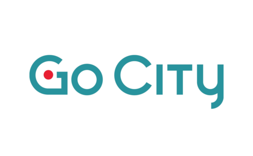
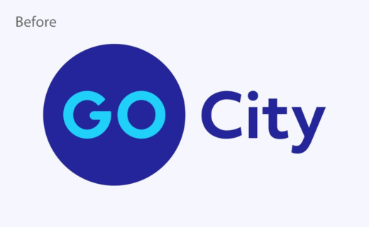
Go City, a leader in attraction passes, has revealed an update to its logo as part of efforts to increase awareness among global travellers.
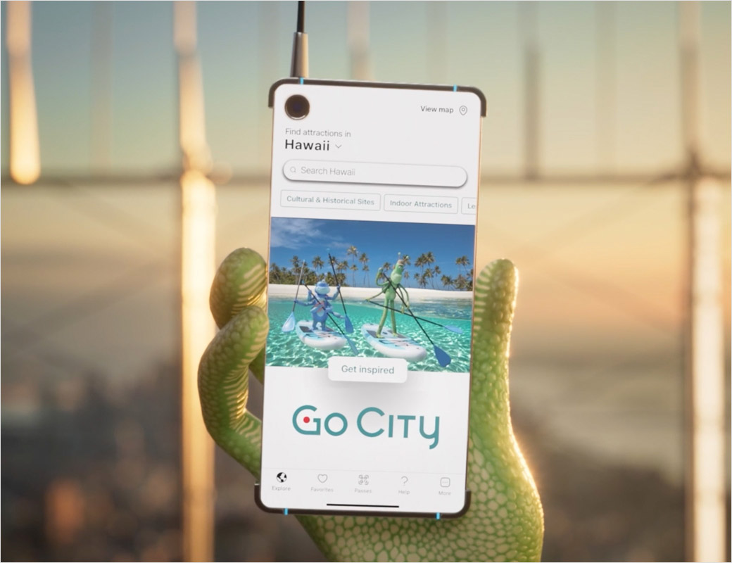
The company's all-inclusive passes – delivered via an app – enable customers the freedom to visit as many attractions in a given destination as they like, all for one fixed price.
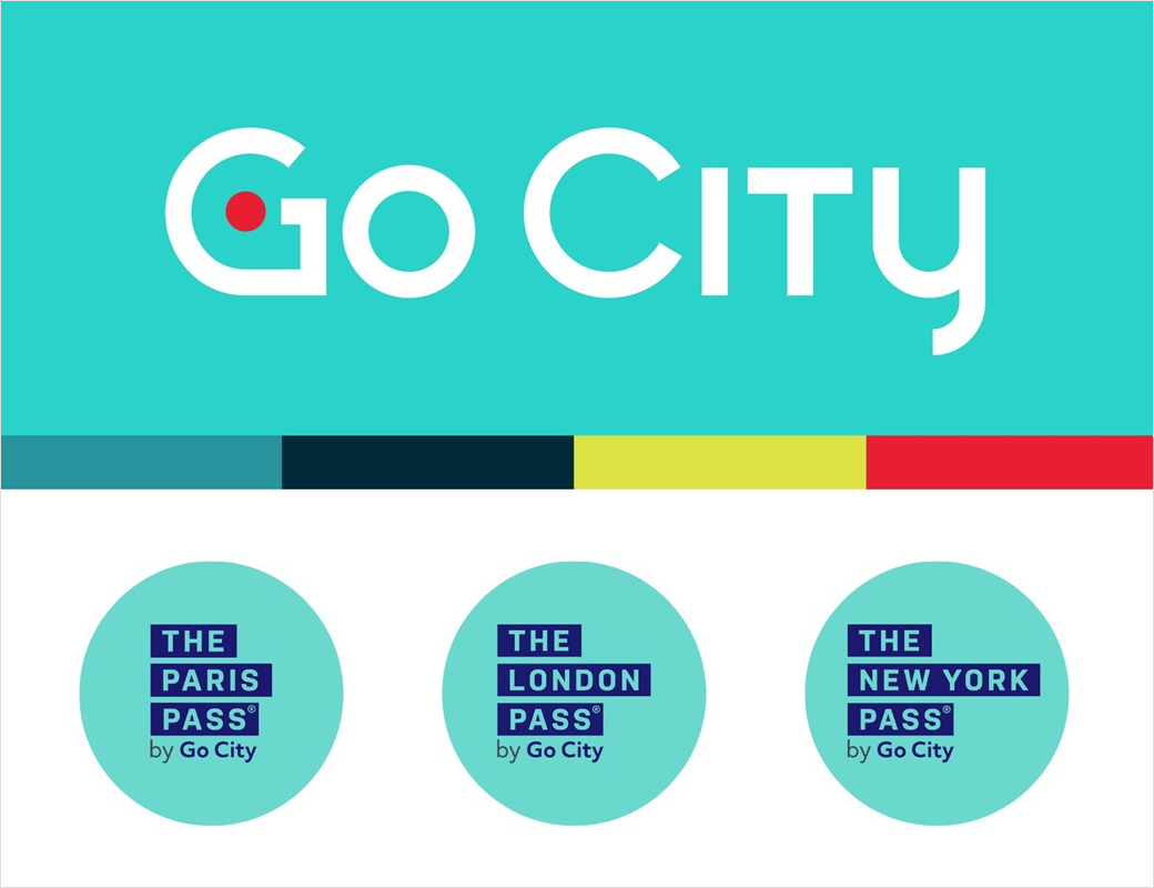
Once known as Leisure Pass Group, Go City now claims to be "the world's largest sightseeing pass business" and currently operates The London Pass, The Paris Pass, and The New York Pass.
The firms new look and feel, which has already rolled out across its website and app, is intended to "bring the Go City family of brands under a cohesive palette, with a modern and tech-forward visual identity."
"The new Go City brand logo and colour palette are inspired by ideas of city travel and excitement, and the ambition of Go City customers. The choice of teal as the new primary colour reflects their inclination to action, and how they seek to get the most out of their trips. The updated logo immediately signals Go City as a travel technology company, with the app icon bringing the Go City 'G' to life as a location pin, reminding travellers of the very best experiences in a city," says the company.
"Our goal is to get Go City into the hands of as many travellers as possible, and to help them have their best city breaks," further comments Jon Owen, CEO of Go City. "We're extremely proud of these changes and are excited to introduce a fresh take on our beloved brand. We aim for every interaction with Go City to feel like a friend giving you their must-see list for a given city. These changes are the first step in that direction."
Go City also says it will be "investing millions" over the next 12 months in a new advertising campaign that will initially target travellers in New York and Los Angeles, before being translated and extended to reach a global audience.
Source: Go City


