High Liner Foods Gets New Logo and Identity by WMH&I
London-based branding agency WMH&I has created the new logo and identity for North American seafood company, High Liner Foods (HLF).
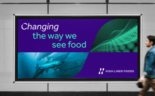
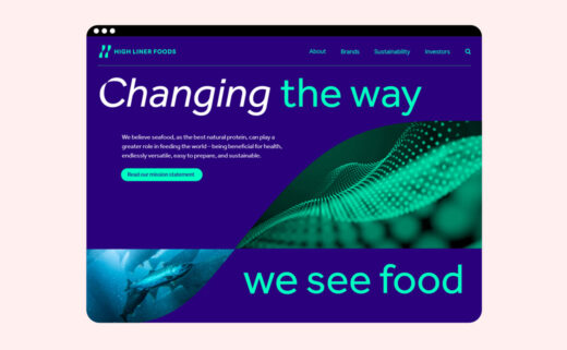
The new look, which is said to be rooted in the central tagline ‘Changing the way we see food’, is aimed at modernising the appearance of what is a 124-year-old company.
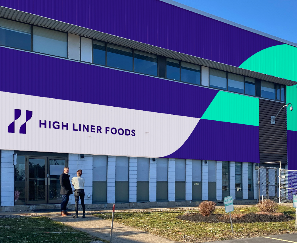
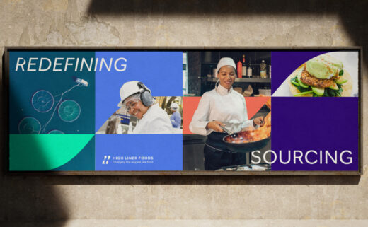
“The WMH&I rebrand brings forward a bold graphic twist as the key element of the new look. It focuses on changing perceptions of High Liner Foods, highlighting its leadership and positive actions towards building an optimistic future for the seafood industry,” says the agency.
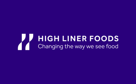
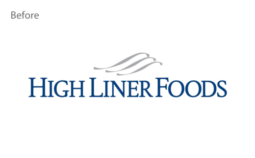
The refreshed logo has been inspired from the previous logo’s waves, “adding meaning and tapping into the brand name itself with an abstract ‘H’”, according to the designers.
“This graphic twist is central to HLF’s new identity. It represents the change of perspective and signifies the active transformation HLF is spearheading in the food industry,” further explains the design team.
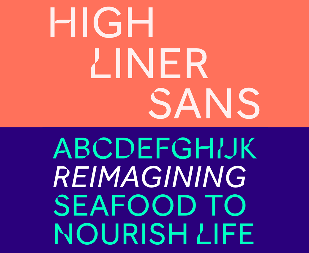
Adding: “It carries through to the typography, which has been given a characterful, modern spin with a modified typeface by Dalton Maag: The High Liner Sans font has exclusive usage for HLF.”
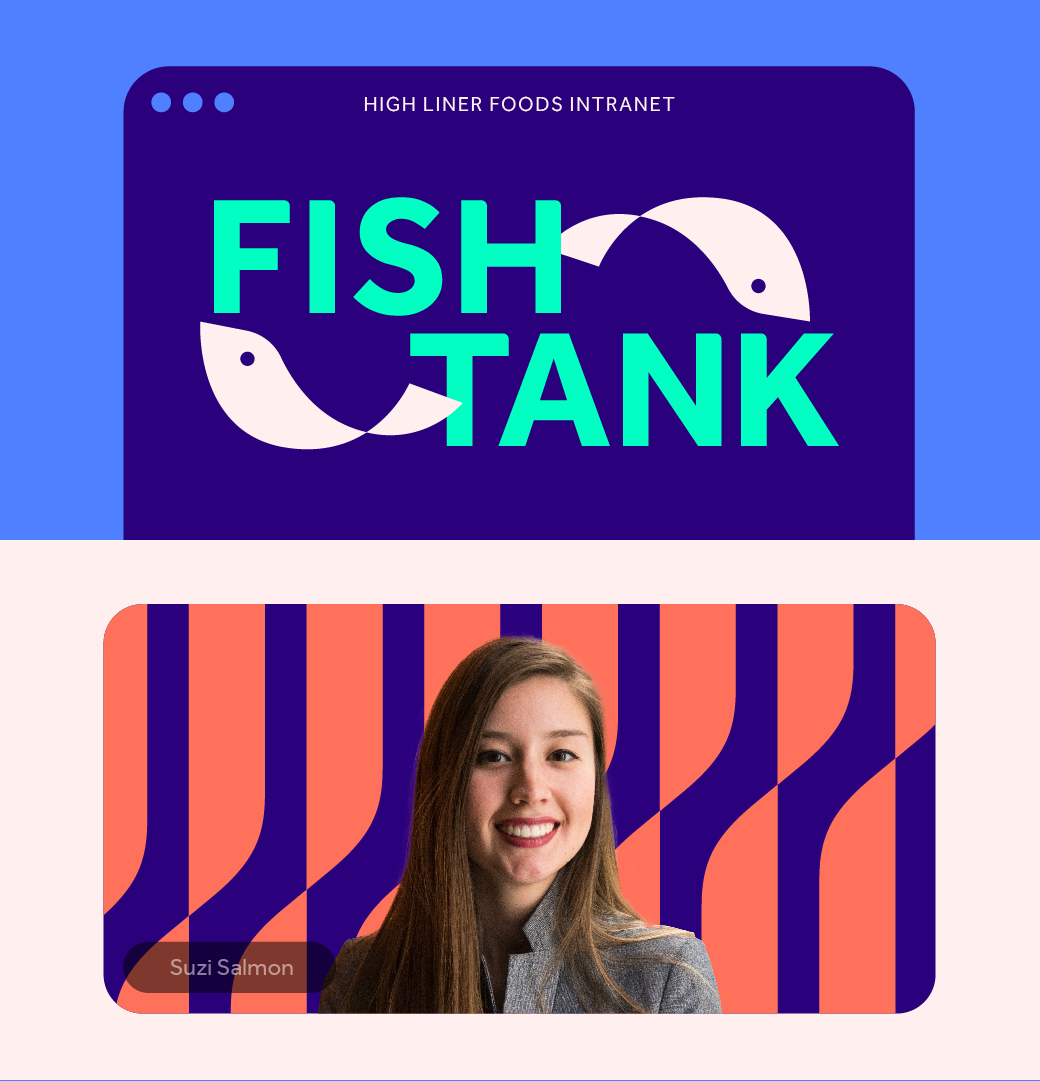
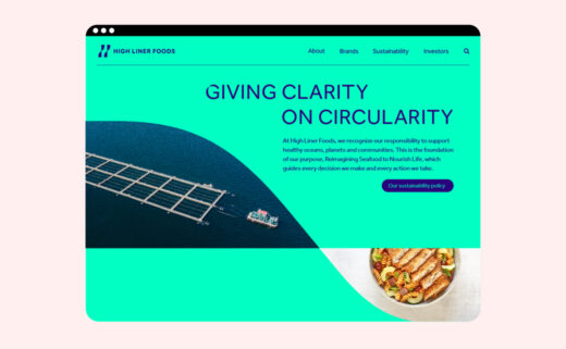
The brand’s original colour palette has also been revised and now features six “sea-inspired” colours that mix blue hues with complementary tones such as “warm salmon” and “seabed white”.
“Guided by our purpose, Reimagining Seafood To Nourish Life, we believe there is enormous potential to inspire more seafood consumption. This new, modern, identity for High Liner Foods is representative of how we are looking at our business, our industry, and our category with a fresh perspective,” comments HLF’s chief commercial officer, Anthony Rasetta.




WMH&I
www.wmh-i.com


