Basketball Team New York Liberty Unveils New Logo Design
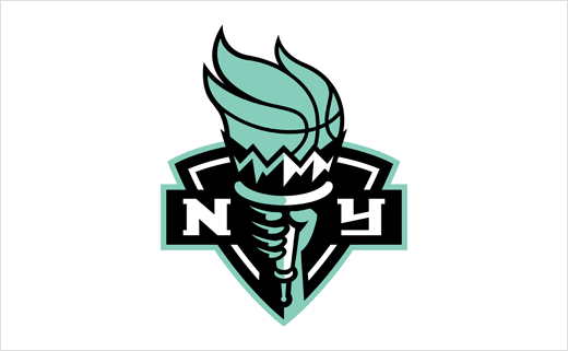
American women’s basketball team New York Liberty has this week unveiled an all-new logo design.
The new look is the first visual refresh the team has undergone since it joined the Women’s National Basketball Association (WNBA) in 1997, which also happened to be the league’s inaugural season.
“While this new logo pays homage to our franchise history and the history of New York City, it also nods to our future and modernises the team’s overall look,” comments Liberty chief operating officer, Keia Clarke. “This new chapter of Liberty basketball in Brooklyn will begin with the roll out of a new visual that energises and excites our Liberty Loyals.”
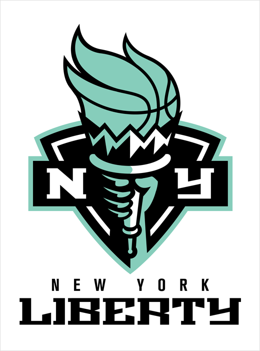
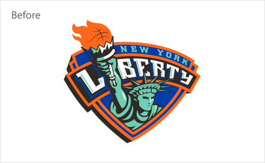
The redesigned primary logo features an updated font, a symmetrical shield, and a “seafoam” colour scheme that moves away from the old orange-and-blue colour palette (a colour mix associated with Liberty’s previous owner, namely, James Dolan, the owner of the New York Knicks).
“New York’s shield demonstrates the franchise’s impenetrable pride and love for its city, while the torch is a symbol of enlightenment,” says the club. “Seafoam green is representative of patina— the colour of the Statue of Liberty due to its ageing process and copper’s reaction to the elements. Seafoam also represents strength, power, and resilience.”
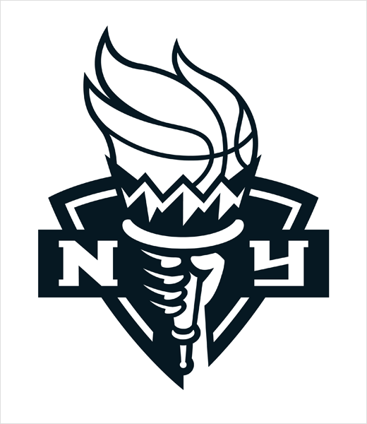
The new logo also gets a black and white variant, which aligns the club with the Brooklyn Nets, who are currently owned by the group that purchased the Liberty back in January 2019.
Source: New York Liberty


