Xerox Unveils Conduent’s New Global Brand Identity
Xerox has announced the latest development in its plan to separate into two independent, publicly-traded companies – unveiling the global brand identity of Conduent, the soon-to-be dedicated business process services company.
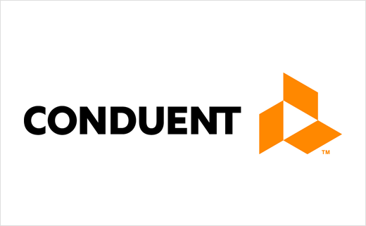
The famous printer and photocopier manufacturer has therefore revealed the typeface treatment and logo Conduent will be adopting after it officially separates on January 1, 2017.
"A bold typeface conveys stability and complements the symbol while acknowledging a 30-year history supporting the critical operations of businesses and governments," say the designers. "A connection between the 'N' and the 'T' in the typeface of 'Conduent' reinforces that the constituent is at the core of the company’s business model. The connected letters also draw the reader’s eye to this unique pronunciation of the coined name."
The three parallelograms that make up the symbol are also meant to convey several ideas about the new company.
"Collectively, they represent movement and agility and represent the relationship between Conduent, its clients and their end users. Individually, they represent three of Conduent’s major stakeholders: clients, employees and investors. The arrow in the centre of the design signals that Conduent helps organisations advance, transform and improve their end-constituent relationships – whether these are shoppers, commuters, patients, customers, employees, or citizens," explain the designers.
The orange colour scheme, meanwhile, is claimed to be unique in the global services sector.
When it begins operations under CEO Ashok Vemuri, Conduent will enter the FORTUNE 500 list with approximately $7 billion in revenue and more than 93,000 employees worldwide.
Source: Xerox


