November 23, 2012
Categories:
Computer & Internet
Branding Tech: Minttulip
Minttulip offer expertise and strategy to organisations looking to implement newly emerging cloud technology.
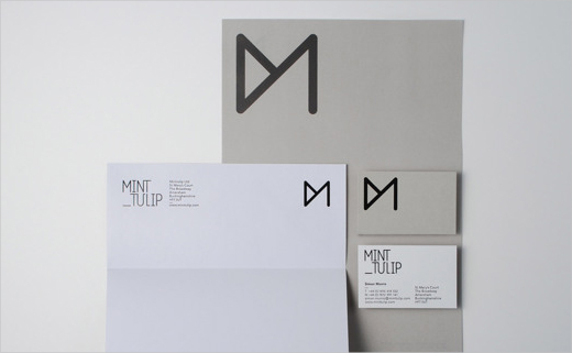
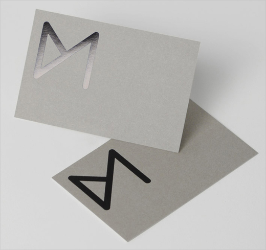
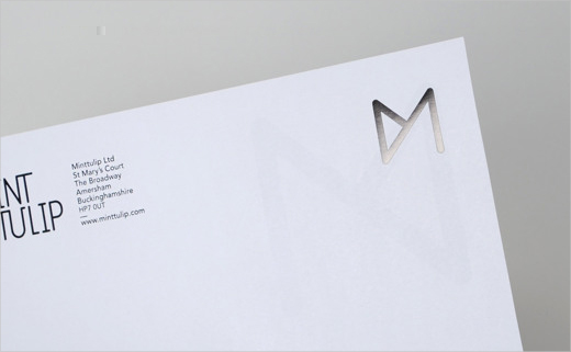
Their logo mark adopts a minimalist symbol resembling an overlapping petal, which also doubles up as a tulip and the letter M. When tilted to one side it also happens to reveal a cocktail glass.
London-based creative agency Sawdust was responsible for the the corporate identity and branding design.
SAWDUST
www.madebysawdust.co.uk


