Car Portal Edmunds Debuts New Logo Design

U.S. car shopping portal Edmunds has unveiled a refreshed logo design as well as a new website.
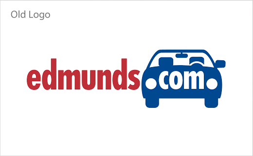
The launch marks the first time it has changed its logo this century. The company is also dropping the ".com" from its name, and will now be known simply as "Edmunds".
Design-wise, the updated logo sees the revised car icon moving to the front, whereas previously it featured at the end of the wordmark, with "com" sitting in between the headlights.
Edmunds has also softened its overall color palette and is emphasising lifestyle-focused imagery on all its platforms in order to create what it says is a more friendly, approachable theme.
"Our new logo, with a smile and a wink, encapsulates how we want an Edmunds shopper to feel once they have quickly and easily found their perfect car," says Sven Wood, Edmunds' vice president of product marketing. "We also use the logo as an everyday reminder of how our products and services should make our industry partners feel about doing business with Edmunds.
"The world of automotive retail is evolving rapidly, and Edmunds is evolving right along with it," adds Edmunds CEO, Avi Steinlauf. "The changes we're making to our site and brand demonstrate our commitment to significantly improving the car shopping experience for consumers and our dealer partners."
The new brand identity has been developed in collaboration with Santa Monica-based RED Interactive Agency.


RED Interactive Agency
ff0000.com


