KURO by Panamo
Design agency artentikon was initially approached by Panamo, a Polish company running a Japanese and Thai restaurant called 'KURO', in Poznań, to make a film advertising their business. However, the guys at artentikon managed to convince their client to go for a full-on logo facelift.
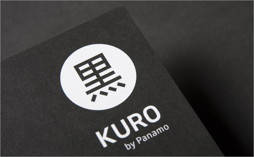
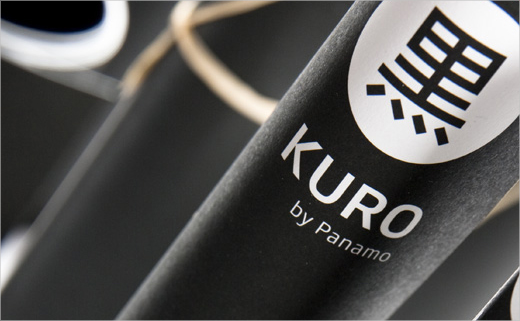
"We streamlined the form of the Japanese symbol of black colour (KURO) and selected a clearer and more minimalist typography" tells us the artentikon team.
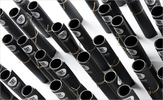
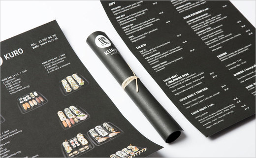
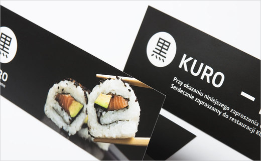
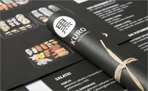
Another important aspect of the project brief was the design and production of promotional identity materials - leaflets, invitations, press advertisements, and even a case for cinema tickets!
The leaflets received the 2010 DESIGN AND DESIGN award and were also published in a book at the beginning of 2011.


