Logo Design for a Printer Repair Business

Printer Repairs are a long established firm providing a maintenance and repair service for office equipment throughout the UK.
London agency Superfried were appointed to re-develop the business identity from scratch. It was important that the new brand looked clean, professional and approachable.
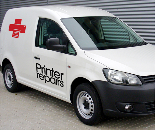
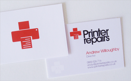
As Printer Repairs trade within a very competitive industry sector, a strong identity was called for. It was felt a distinctly icon-esque logo would work best in addition to a different marketing approach to the competition. The business would be pitched as the 'emergency service' for office machines.
Whilst developing the identity, the designers could not help but to notice the resemblance between printer symbols and a cross shape; they therefore referenced the Red Cross symbol, which provided both recognition and the required medical connotations.
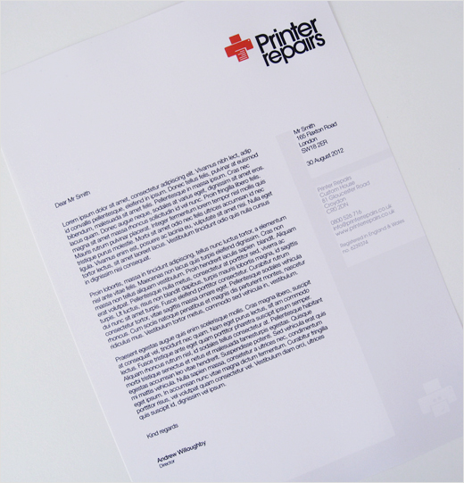
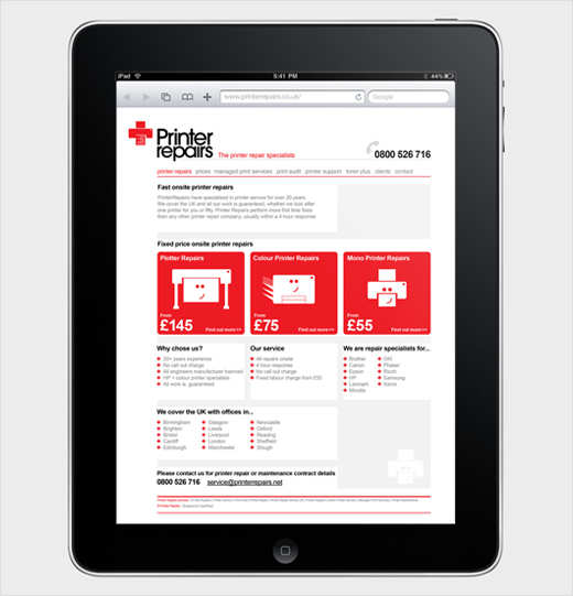
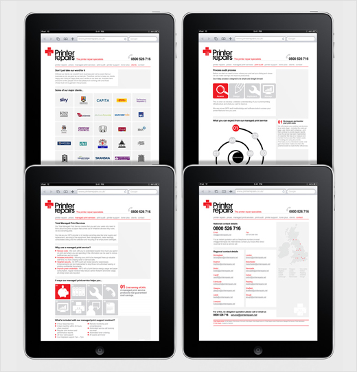
To accompany such a conspicuous icon, a simple, more plain style was adopted for the typography. A clean and clinical style was further implemented for the design of the company's website.
Superfried
www.superfried.com


