Mazda Unveils New Modernised Logo Design

This past week, at the annual Tokyo motor show, Japanese car manufacturer Mazda has revealed plans to gradually introduce a new version of its logo.
The updated design is said to embody the spirit of a particular brand symbol that the company first introduced in June 1997.
It represents the letter 'M' and visually suggests soaring wings.
"This embodies the company’s commitment to continuous self-reform and dynamic, unceasing growth," says Mazda.
Adding: "The sleek and bold form enhances visibility, particularly in digital environments, resulting in a more refined design."
The redrawn symbol is also accompanied by a revised wordmark that adopts a similar modern style.
Mazda is part of a growing trend among car brands that have recently moved away from three-dimensional logos in favour of a flat design.
Aside from this latest update, Mazda's logos since the late 90s have regularly featured a metallic appearance, with a three-dimensional effect and a grey gradient to create the look of shiny metal.
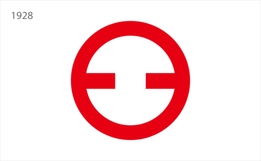
The company was originally founded in 1920 as Toyo Cork Kogyo, a cork-making factory located in Hiroshima.
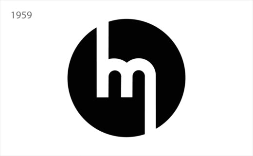
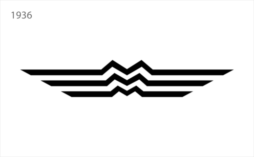
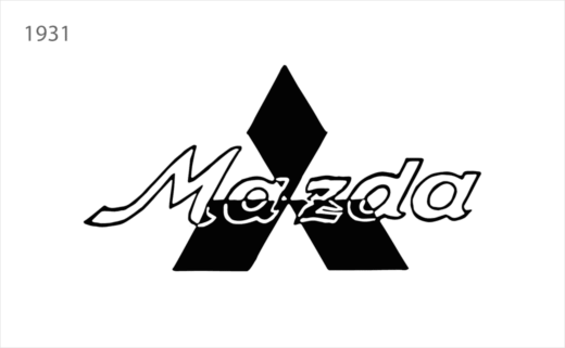
In the 1930s, the business transitioned to vehicle production and eventually adopted the name Mazda.
The latter is thought to be derived from founder Jujiro Matsuda's name while also referring to Ahura Mazda, the one god in the ancient Iranian religion of Zoroastrianism, with Mazda meaning 'wise'.


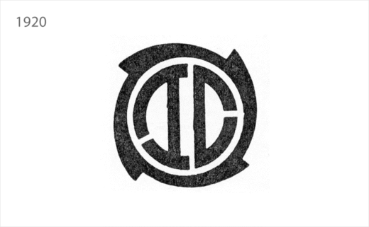
Source: Mazda


