New Identity Design Revealed for King Edward VII’s Hospital
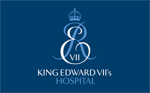
King Edward VII’s Hospital is said to be London’s foremost private hospital. It was founded in 1899, at the suggestion of the Prince of Wales (later King Edward VII) by Agnes and Fanny Keyser who opened their home to nurse sick and wounded officers returning from the Boer War. Edward VII became the first royal patron of the Hospital that was originally called King Edward VII’s Hospital for Officers. In 2000 its name was changed to King Edward VII’s Hospital Sister Agnes. The Hospital’s royal patronage continues to this day with Her Majesty The Queen. Its president is HRH The Duke of Kent.
Design consultancy Offthetopofmyhead was appointed in September after a three-way credentials pitch. The brief was to create a new graphic and language identity for the hospital in order to help increase its revenue by growing patient numbers, patient revenue and fundraising income. The identity also needed to support a new integrated marketing and fundraising strategy and the development of new services. And it had to further help attract new consultants, increase revenue from existing consultants and increase referrals from GPs.
However, King Edward VII’s Hospital was looking for evolution not revolution and an identity that would reflect the Hospital’s 'elite' positioning.
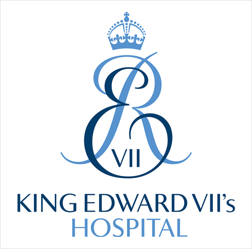
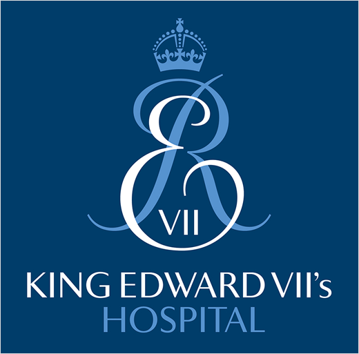
John Spencer, Offthetopofmyhead founder and creative director says, “Our biggest creative challenge was to balance the Hospital’s heritage and traditional values with its world-renowned nursing and medical care, and state-of-the-art facilities. King Edward VII’s cipher has been the hospital’s logo for around 100 years. It’s a massively valuable asset because no one else can use it and its graphic individuality distinguishes it from all its competitors.
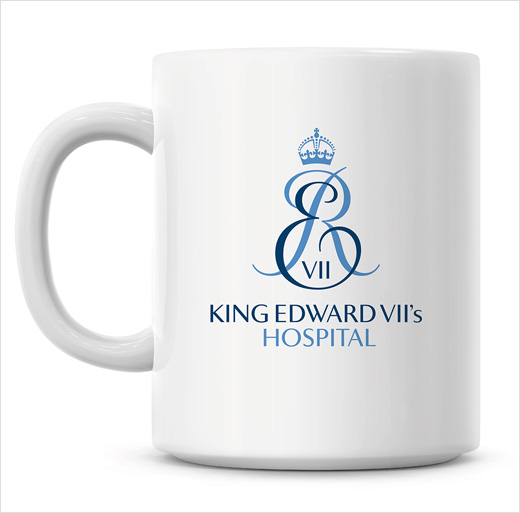
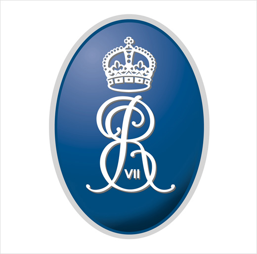
“There are many representations of King Edward VII’s cipher around the Hospital. Some of them are old and some more recent – and they’re all very different. The old logo looked tired, was difficult to use and really didn’t reflect the Hospital’s reputation. The cipher had been re-drawn many times and had lost its form and become illegible. So we’ve liberated King Edward VII’s cipher from it’s badge-like oval and given it back its energy and elegance. The idea to redesign the cipher in two colours was inspired by a rare coronation mug from 1902. ‘Sister Agnes’ (the name given to Agnes Keyser by the king) has been dropped from the Hospital’s name because it was confusing – and a bit of a mouthful. The more descriptive words, ‘Founded by Sister Agnes’ are now used in a supporting role but unrelated to the logo.”
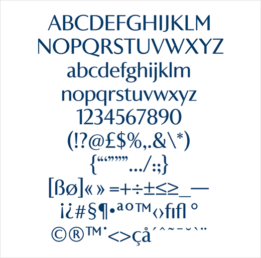
John says he worked with typographer Alan Meeks to create the new logo. Alan also designed a custom headline font called Agnes Sans derived from the logo’s namestyle. The font was given its name by staff member Lawrence Taljaard.
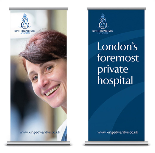
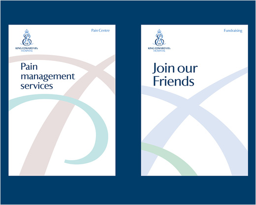
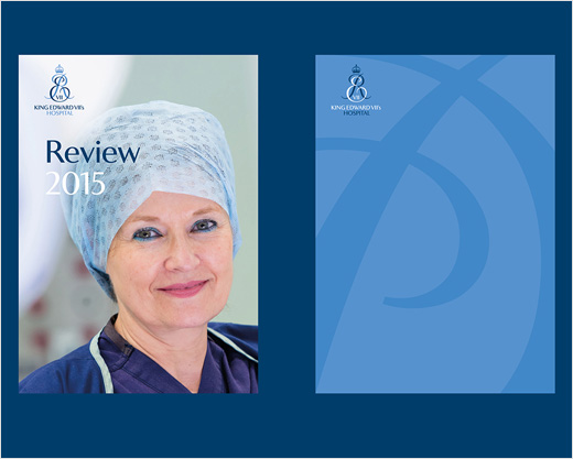
Rollout of the new identity has just begun. Applications include stationery and multiple business forms, the Hospital’s brochure and annual review, PowerPoint templates, patient information, Friends magazine, internal and external signs, flags, security badges and passes, exhibition displays, promotional items such as cufflinks, ties and pens, and a new website, which is scheduled to go live in April.
Offthetopofmyhead
www.offthetopofmyhead.co.uk


