The Partners Rebrand Shakespeare’s Globe
Branding agency The Partners has created the new logo and identity for Shakespeare’s Globe.
Set in the London Borough of Southwark, on the south bank of the River Thames, Shakespeare’s Globe is in reality a modern reconstruction of a round-shaped building that was first built in 1599, destroyed by fire in 1613, rebuilt in 1614, and then demolished in 1644.
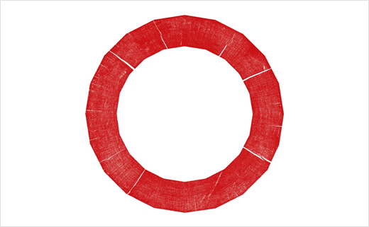
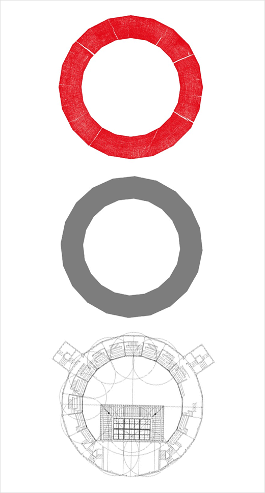
Replacing the old Pentagram-designed logo, the theatre's new ‘circular’ symbol is a 20-sided polygon that references not only the architecture of the original theatre built in the 16th century, but also the prologue of Shakespeare’s play Henry V, wherein the Globe is described as "this wooden O".
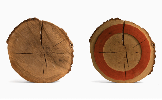
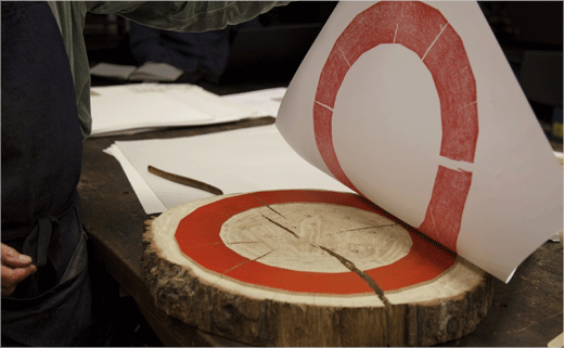
The designers are further keen to point out how the new logo is actually made from a circular piece of oak that had been on display in the permanent exhibition devoted to the reconstruction of the theatre (founded by actor and director Sam Wanamaker, the 'modern' Globe officially opened to the public in 1997).
"It’s like a holy relic," says The Partners’ creative director, Nick Eagleton. "It appears to be the only remaining circular piece of oak from the timber used to rebuild the Globe."
"So we decided we wanted to make a print block out of it," adds design director Katherina Tudball, "and print the logo from it".
The logo is further matched with livery whose red, black and white hues are said to derive from the colours used in early printing processes.
The Globe’s new typeface, Effra, which is an updated version of a typeface from 1816 called Caslon Junior, has also been chosen for its "historic roots".

The Partners
www.the-partners.com


