DEFINITION 6 Rebrands TV Network – Great American Country
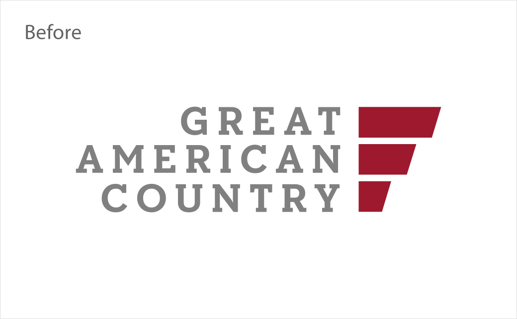
Customer experience agency DEFINITION 6 (D6) has rebranded American cable television channel, Great American Country.
Beginning life back in 1995 as a country music channel known as Jones Radio Network, "GAC Family", as it has now been renamed, airs alongside "GAC Living" (formerly Ride TV).
Both new identities officially relaunched on September 27th, with GAC Family debuting under the tagline "Stories Well Told" and GAC Living with the slogan "Life Well Lived".
Led by senior vice president/creative director Crystal Hall, D6 developed the creative strategy and visual brand identity for both networks, working closely with Bill Abbott, president and CEO of GAC Media, the parent brand that bought the two channels earlier in the year from entertainment giant, Discovery Inc.
"The D6 team approached this ambitious project with a tremendous amount of enthusiasm and successfully brought our brand vision to life for our new flagship networks," comments Abbott. "Fan feedback has been incredible, and we look forward to using this momentum to launch our original slate of family-friendly Christmas programming this holiday season."
In bringing these brand values to market, D6 says it was tasked with visually and tonally articulating two distinct entertainment brands in GAC Family and GAC Living, which collectively reach a reported 40 million TV households.
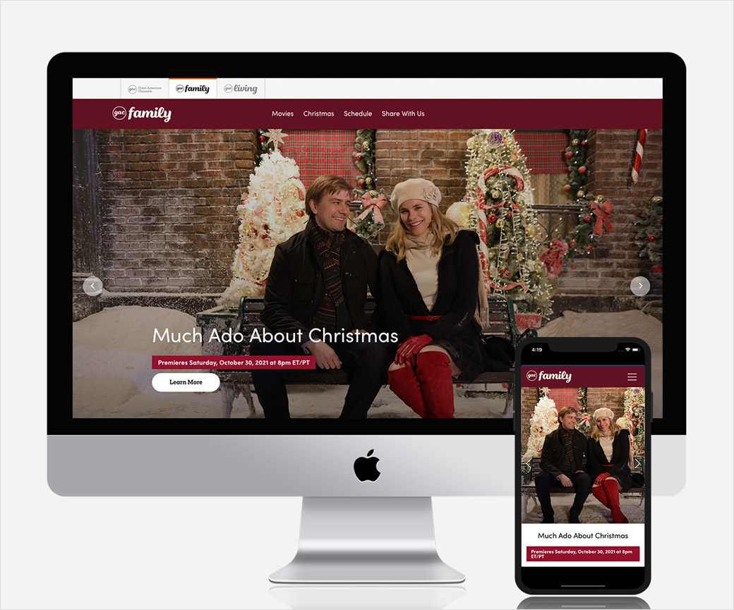
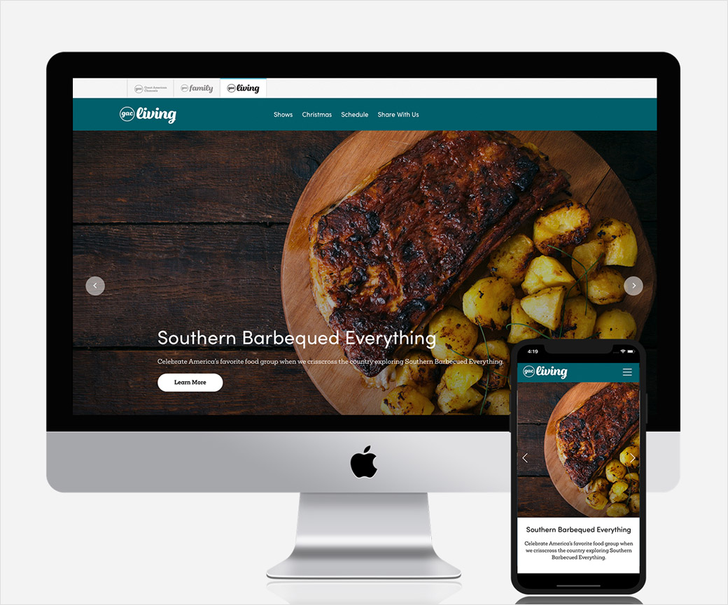
From creative strategy to execution, D6 handled the full branding and launch initiative under one roof. Deliverables included network logos, mnemonics, on-air graphics packages, a launch promo campaign, and websites.
"We wanted the brand identity of each network to express a sense of family, joy, and togetherness in their own unique way, making the viewer feel at home, whether they are tuning in or engaging with GAC content and talent online," explains Hall. "As both GAC Family and GAC Living hang their hats on the celebrations that bring families together, we future-fitted these brands so they could evolve with the seasons in a unified way."
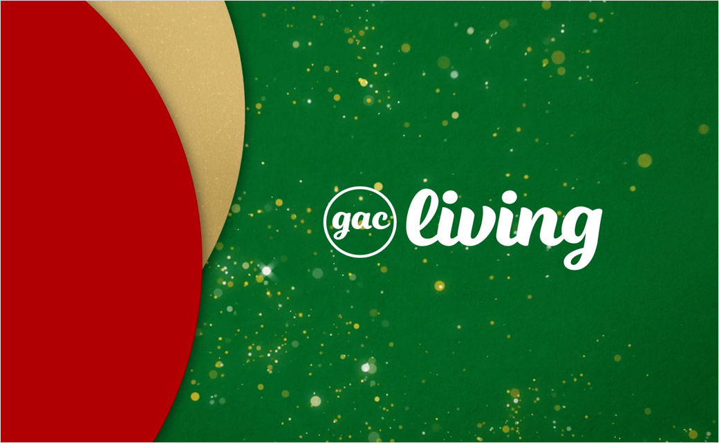
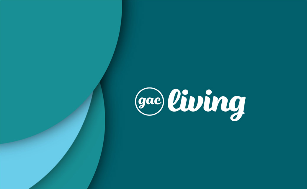
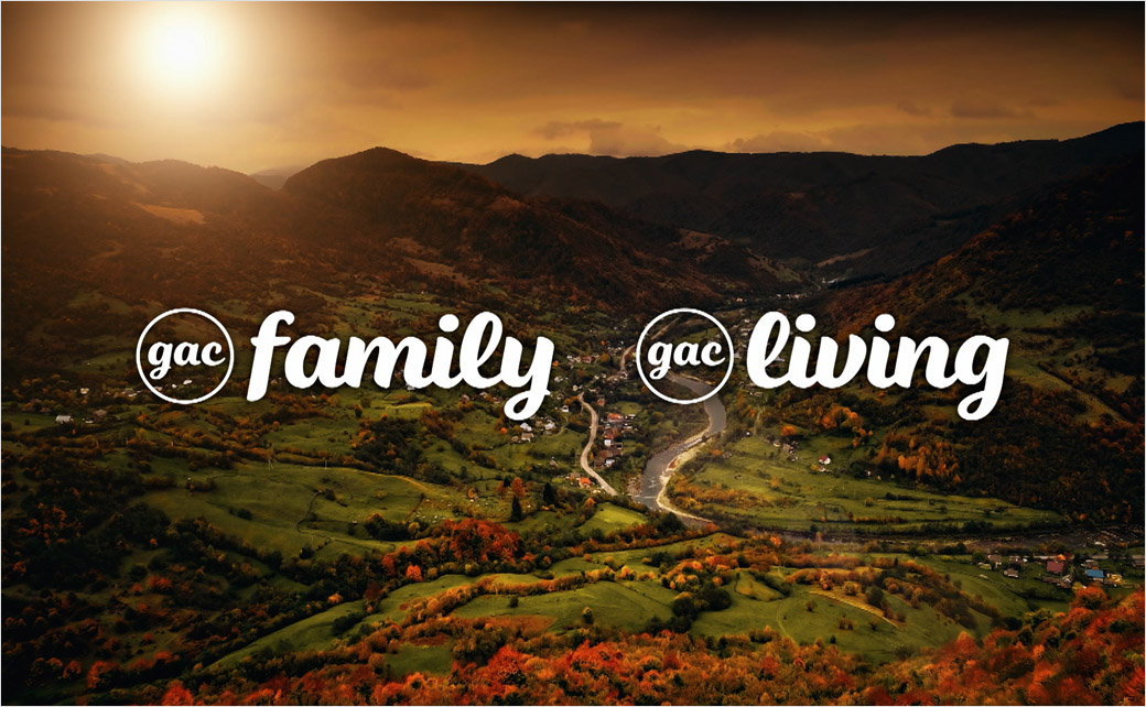
D6 kicked off the project with logo explorations, landing on a circular concept alluding to themes around family and home. Designed with matching lock-ups, the GAC Family and GAC Living logos both feature an encircled GAC "brand stamp" in a lower-case script font. The words "Family" and "Living", respectively, are oriented to the right using the same typeface.
Extending the circle concept to the on-air look and motion language, D6 incorporated the circles as a mortise for promos, station IDs, bumps, and more.
Both channels also use distinct colour schemes, for example, GAC Family uses a modular colour palette of rich, warm colours derived from holidays, seasons, and occasions its programming will be focused on, while GAC Living uses cooler colours to express the channel's "lively unscripted lifestyle content".
"GAC Family and GAC Living are not just channels, they are destinations," says Rich Rosario, D6 creative director and producer on this project. "Bill and his team wanted to establish Great American Channels as a trusted, welcoming place for its viewers, so we set out to do just that. From the design and colour choices to the use of imagery and sound, we strove to create a haven where people come together to celebrate and experience life's most festive and special moments."
