Chicago Fire FC Unveils New Logo Ahead of 2022 Season
American soccer outfit Chicago Fire FC has revealed a new primary logo and visual identity following what it says was a long “fan-focused” project that reportedly saw over 20,000 club fans, supporters, and Chicagoans at large play a role in shaping the new look.
Created by football logo specialist Matthew Wolff, the new crest’s core elements were said to have been inspired by the collective voice of Fire fans through a series of roundtables, website submissions, surveys, and social media responses.
Wolff spent more than six months exclusively focused on the project working alongside the club and its fans.
“As much as this project was about the creation of a new crest for the Chicago Fire, it was also about renewing a spirit of cooperation and collaboration with our fans,” says Fire owner and chairman, Joe Mansueto. “We made a commitment in January to welcome anyone who wanted to lend their voice to this project and the result is a crest that was fully and completely inspired by what we heard from our fans and supporters. We’re hopeful all will wear the new crest with pride and feel it represents not only this storied Club, but also the great city of Chicago.”
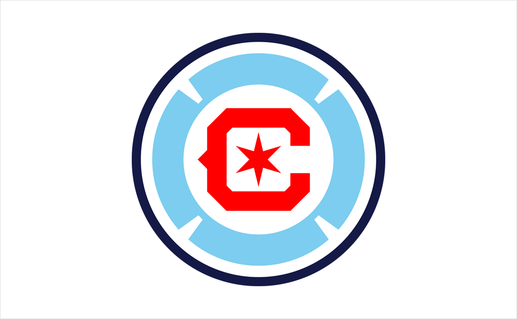
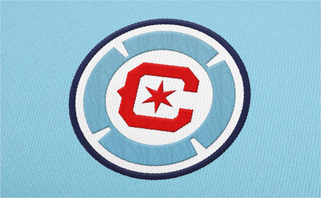
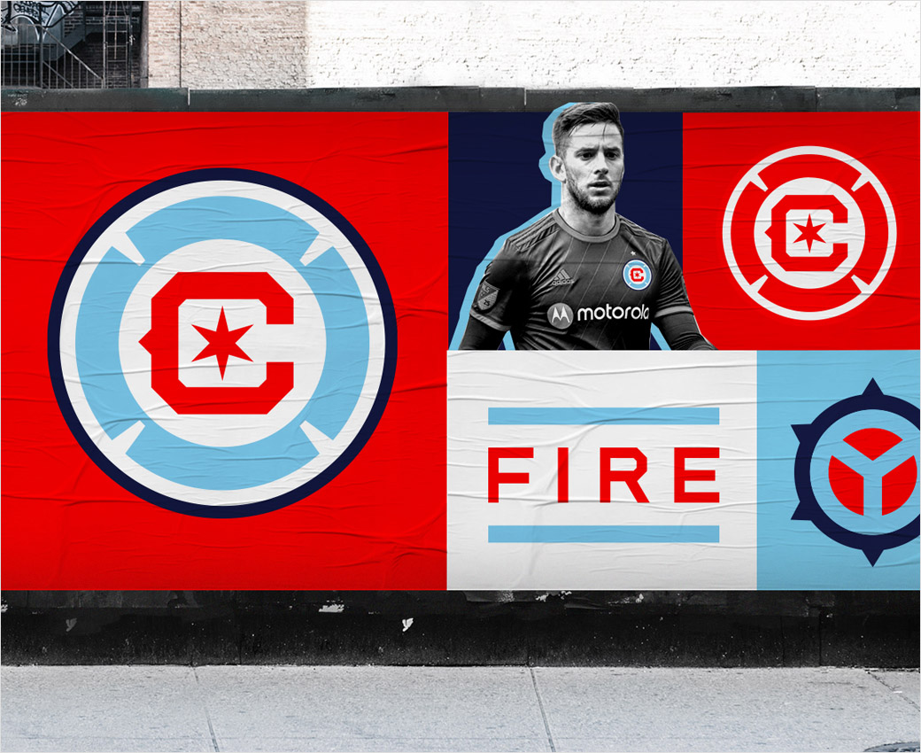
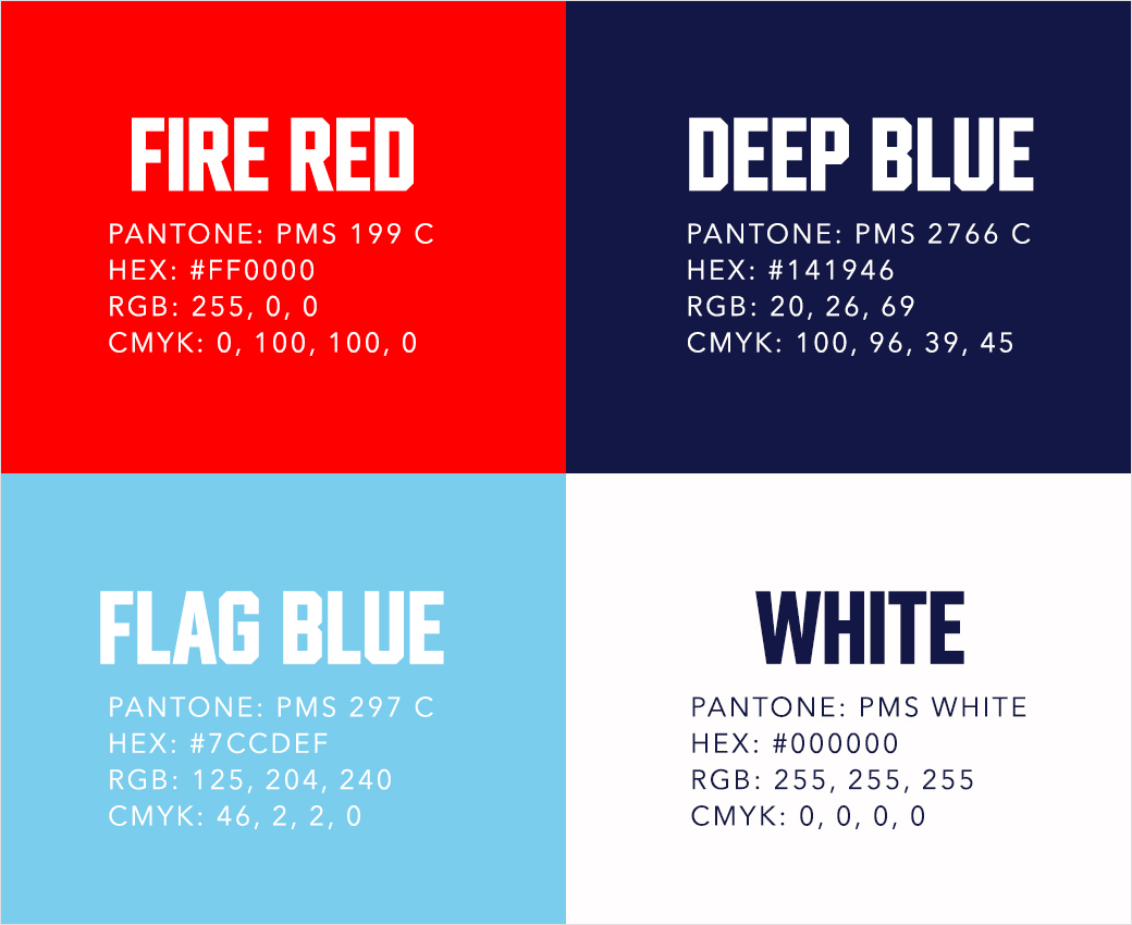
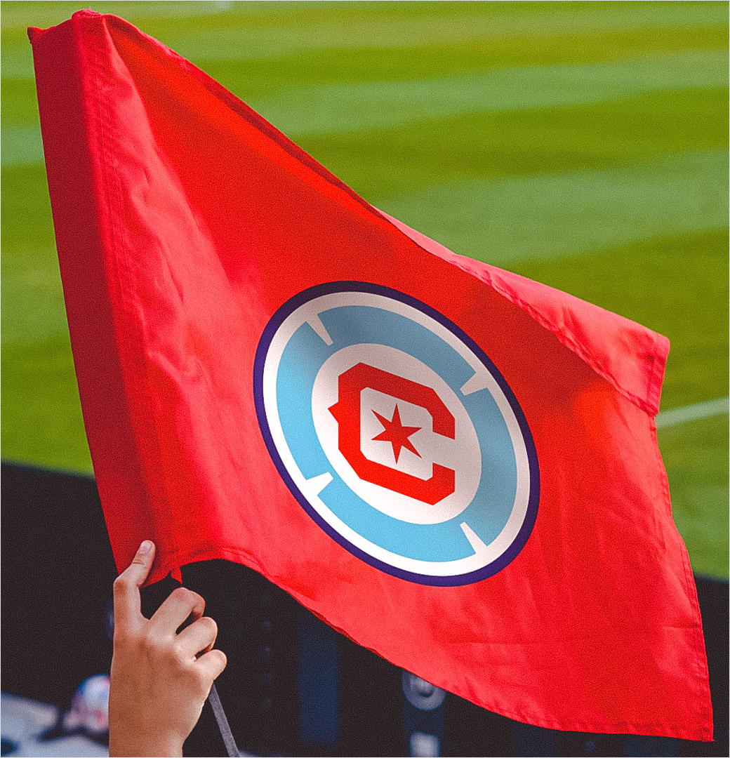
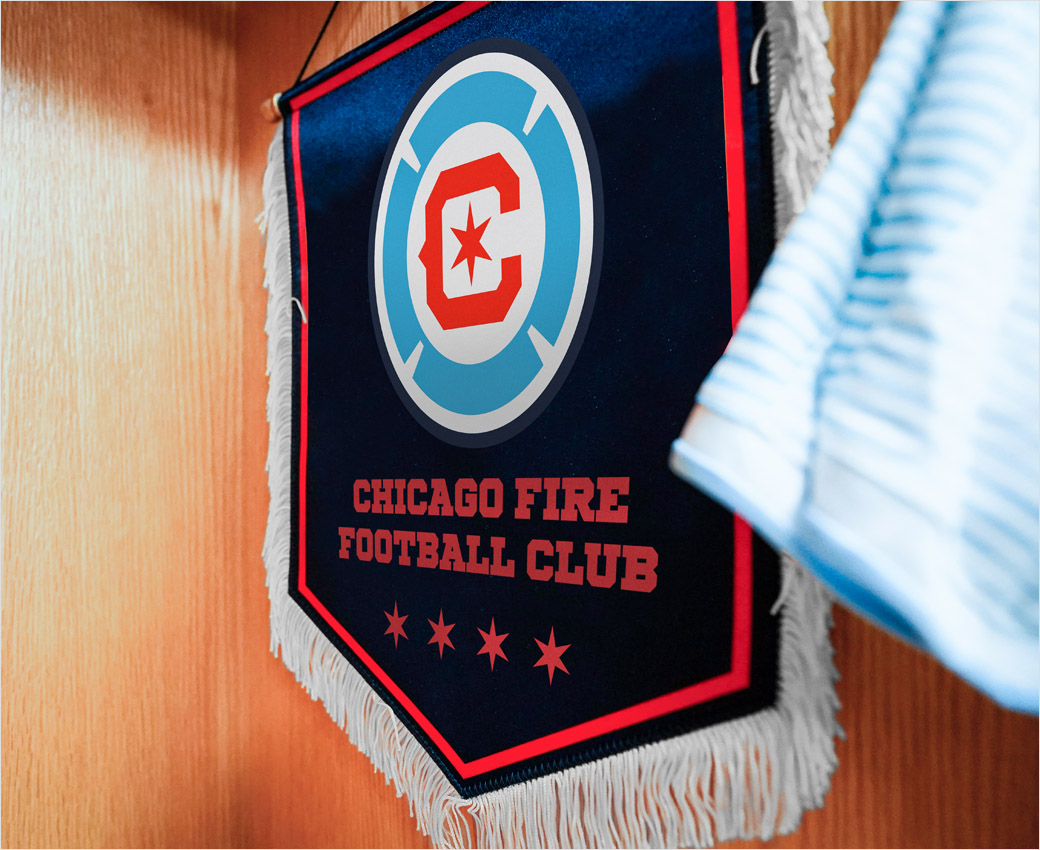
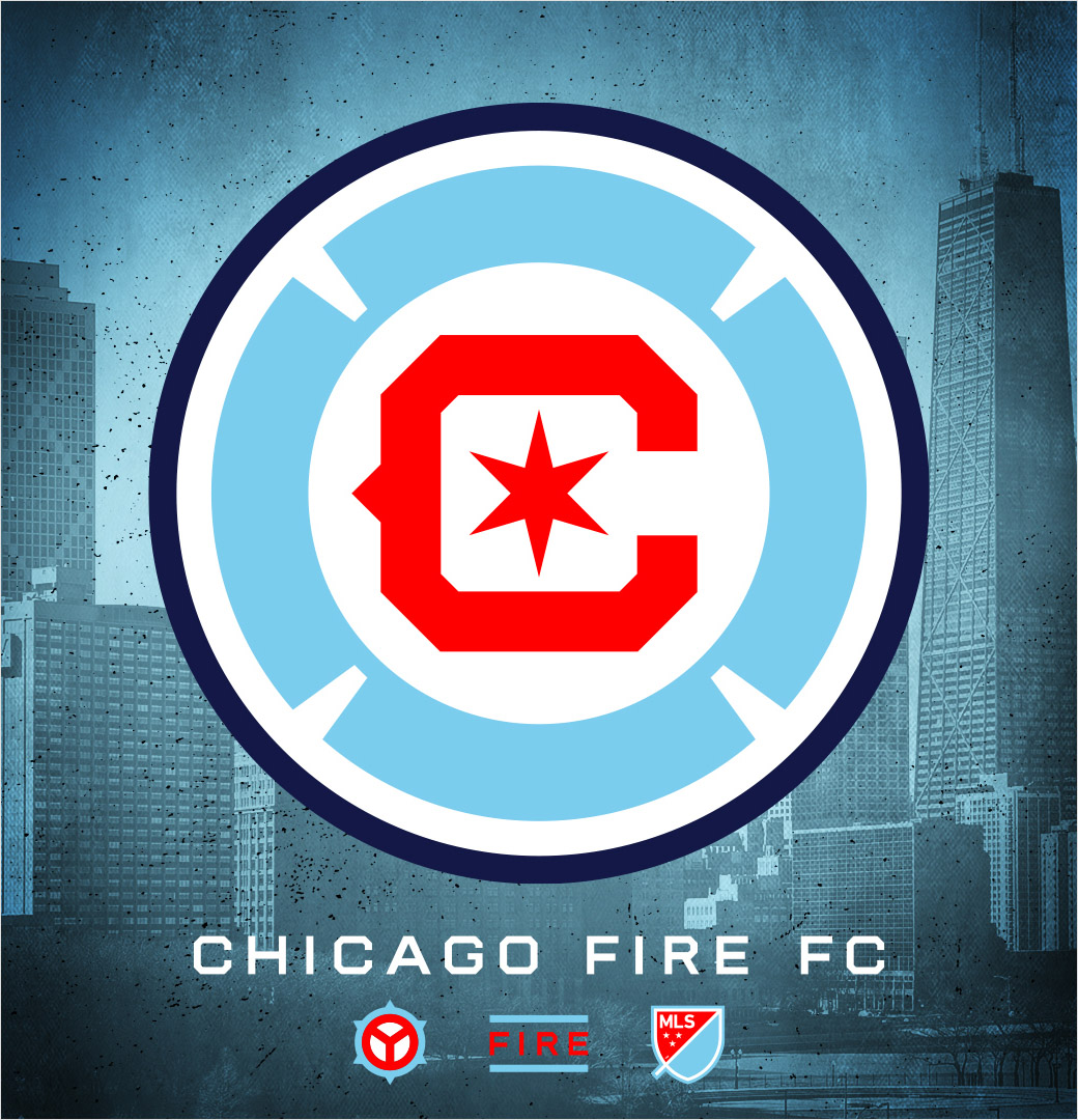
The new crest’s primary elements – a six-pointed star contained within the letter “C”, surrounded by a modernised Florian cross incorporating the Chicago city flag colours – were the most commonly requested items across all fan touchpoints.
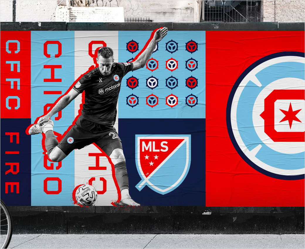
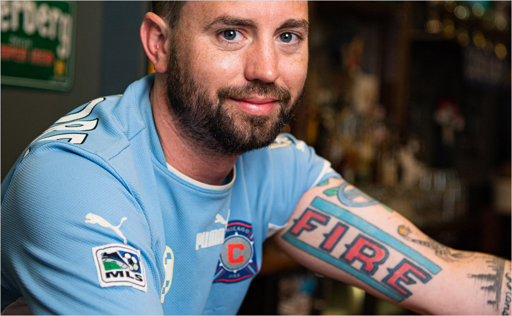
In addition to the new primary crest, Wolff also designed a custom wordmark, and two secondary marks: a stylised municipal device surrounded by six star points and a mark featuring the word “FIRE” separated by two flag blue bars. The latter being inspired by the tattoo of longtime Fire supporter Pattrick Stanton.
“I got my Fire tattoo back in 2009 after seeing the flags my fellow supporter Liam Murtaugh designed,” says Stanton (pictured at the bottom of this post). “That my tattoo has now inspired Matt Wolff’s design of a new mark in 2021 is a real honour. I can’t wait to see it in use at Soldier Field.”
The new logo is set to replace the previous design – dubbed the “Fire Crown” – that was largely met with derision from fans upon its unveiling in 2019.
Club Owner Mansueto subsequently decided on a rebranding process that kicked off at the start of this year.
“If the existing badge wasn’t working for them that we’d fix it – and that’s what we are going to do,” penned Mansueto in an open letter addressed to fans back in January.
The new crest will be in full use at the start of the 2022 preseason as the club prepares for its 25th season in the MLS.




Source: Chicago Fire FC


