GREEN & BLACK’S Chocolate Gets New Look by Bulletproof
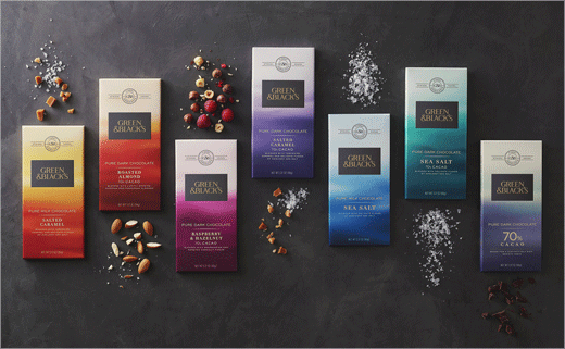
The New York office of strategic branding agency Bulletproof has created a new identity and packaging design for GREEN & BLACK’S.
Owned by Mondelēz International, the ‘premium’ chocolate brand originally launched in the UK in 1991. Bulletproof was enlisted in January 2016 to create a “vibrant and cohesive” look for its new Pure Dark and Pure Milk chocolate bars.
“We needed to portray premium indulgence in a brand aesthetic that appeals to today’s consumer – the world of mass luxury has moved on, but seemingly chocolate has remained firmly rooted in the past,” says Bulletproof.
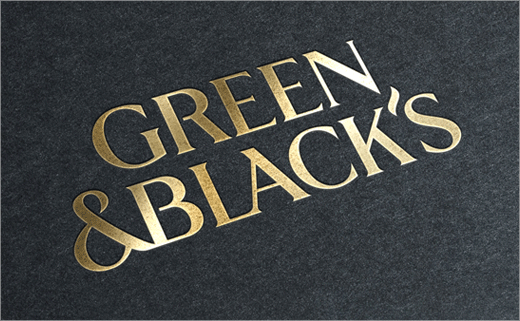
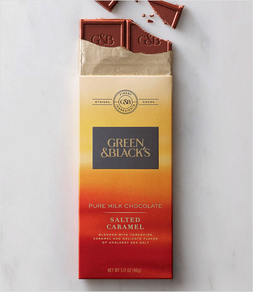
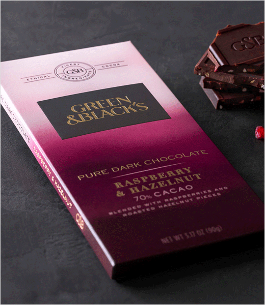
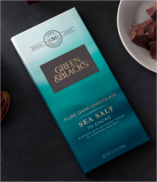
The new look includes a revised all-caps logotype that sits within a charcoal grey holding device, and above which is placed a newly-designed “quality seal” that further incorporates a “G&B” monogram.
“We started by stripping the brand down to its core equities and reassessing those against our objectives; every element needed a purpose and clear role in telling the GREEN & BLACK’S story,” explain the designers. “We created the ‘quality seal’, clearly communicating our point of difference as a brand, which stands for both the finest ingredients and ethically sourced cocoa, creating a superior taste experience.”
The chocolate brand’s colour palette has also been modified as part of the redesign, which is claimed to give the refreshed packaging added “depth and meaning”.
“We landed on the idea of connecting the GREEN & BLACK’S brand DNA of nature (Green) and indulgence (Black) in the form of landscapes, delivering a sensual, more indulgent take on colour,” say the designers.
The new branding and packaging has already rolled out both in the US and UK.
Bulletproof
www.wearebulletproof.com


