Charlotte Hornets New Brand Identity Revealed
The Charlotte Bobcats took the next step in the process of becoming the Charlotte Hornets recently when Chairman Michael Jordan unveiled the brand identity that will be used when the Hornets name returns to Charlotte for the 2014-15 season.
The team’s logos and wordmark were introduced during an on-court halftime ceremony that was emceed by Fox SportSouth’s Stephanie Ready.
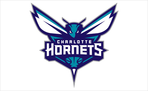
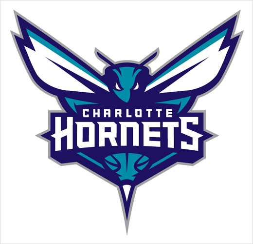
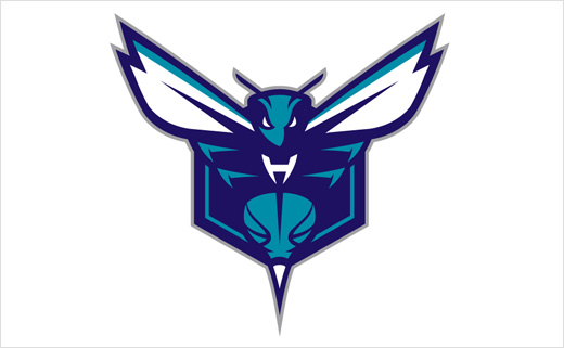
The primary logo utilises the purple and teal color palette and features an aggressive-looking hornet that is ready to attack. Incorporated within the logo is a basketball that doubles as the hornet’s body. The Charlotte Hornets wordmark is written across the insect. The logo contains several odes to that of the original Hornets with its white wings, white accents within its eyes, a stinger and the inclusion of a basketball.
The logo aims to represent several characteristics of actual hornets, including their swarming and attacking nature. These same characteristics aim to connect with the city of Charlotte itself. The city’s rebelliousness, aggressiveness and protective attributes date to the Revolutionary War when British commander General Cornwallis referred to Charlotte as “a hornet’s nest of rebellion.”
“The logos are the foundation of an organisation’s brand identity, and our goal was to design logos that would have awareness, be relevant and resonate with our fans,” said Bobcats Sports & Entertainment President & COO Fred Whitfield. “We developed a logo that physically depicted the characteristics and DNA of the type of team we want on the court, as well as those of hornets and the city of Charlotte.”
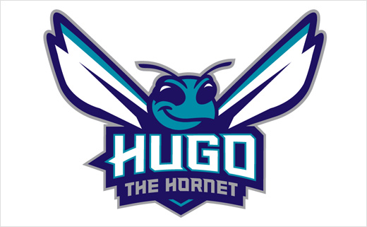
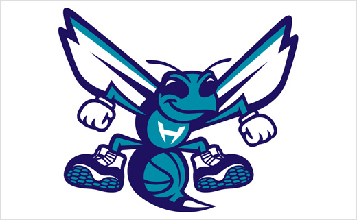
As part of the unveiling, the organization also announced that “Hugo” will officially return to Buzz City as the team’s mascot. The Hornets brand identity includes a modernised version of the original “Hugo” logo that will be utilised for the mascot and its brand. The refreshed Hugo logo contains several similarities to the original, with Hugo wearing white gloves and basketball shoes, possessing that trademark smile and having the letter “H” on his chest. Rather than bouncing a basketball, the updated logo continues the theme of the basketball as part of the hornet’s body.
“We recognise the heritage behind the original logo and our goal was to connect to the past but also include elements of an evolution,” Whitfield added.
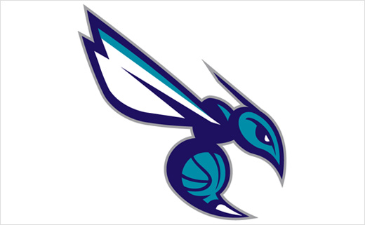
The secondary logo features a side view of the hornet in an attacking position with elongated wings, aggressive eyes and extended stinger. The body once again consists of a basketball, while the curled body shape represents the letter “C” for the city of Charlotte. It also consists of the purple and teal colors like the primary logo.
The Hornets wordmark includes the word Charlotte in teal written above the purple Hornets name. The entire brand identity – logos and wordmark – was designed in collaboration with senior executives within the Bobcats organisation; Jordan Brand, a division of Nike; and the NBA’s Global Merchandising Group.
Both Jordan Brand and Nike have a long history of working with professional teams and universities in developing brand identities and utilise some of the world’s most highly recognised designers.

Source: Charlotte Hornets


