Outboard Manufacturer Tohatsu Unveils New Logo Design
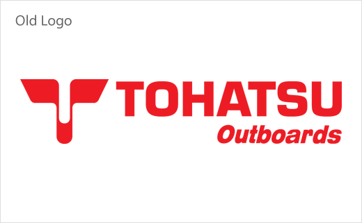
Japanese outboard manufacturer Tohatsu has revealed an all-new logo design at the 57th Genoa International Boat Show held in Genova, Italy.
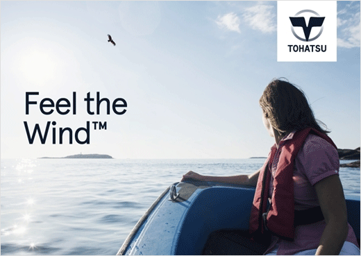
The refreshed logo, dubbed “Blue Wings”, is also accompanied by a new tagline called “Feel the Wind”. Both form part of the company’s new global brand campaign, which is in turn based on a new marketing strategy that will be deployed at boat shows around the world over the coming year.
“The Tohatsu Blue Wings evokes the image of the sea hawk, a bird that soars over the oceans of the world. The circle represents the sea. The sea hawk’s wings which transcend it symbolise Tohatsu innovation, the pioneering ideas that inspire action that transcends the conventional,” said a company spokesperson.
Bosses at the Tokyo-headquartered business say they expect the new look to better help Tohatsu to target its key demographic of millennial boat owners born between 1977 and 1995.
Called “SMARTS”, the latter currently account for 17% of total boat owners, and are further predicted to drive the next generation of the boat market, particularly in North America and Europe.


Source: Tohatsu


