Qualidigm Healthcare Unveils New Logo Design

Qualidigm, the national healthcare consulting company based in Connecticut in the USA, has revealed a new logo and redesigned website.
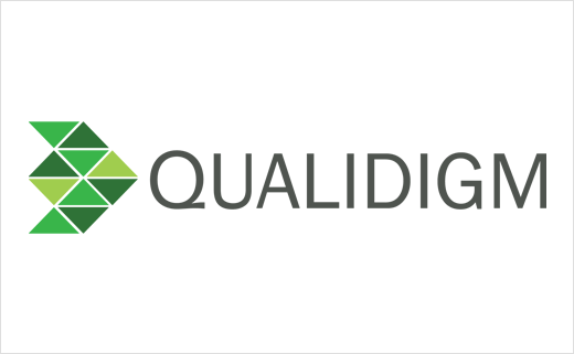
Along with a more modern font, the refreshed logo mark is composed of ten triangles, using a new green corporate colour palate.
The triangles are claimed to represent Delta (4th letter of the Greek alphabet), symbolising "change" in scientific notation, as well as what Qualidigm says are the three components of the "Triple Aim" in healthcare, namely, improving patient experience of care; improving the health of populations; and reducing the per capita cost of health care.
"Qualidigm has adopted a logo that is clean, edgy, and angular, representing momentum and flight," says company president and CEO, Dr. Timothy Elwell.
The new website, meanwhile, aims to offer a glimpse into the company’s culture and what it’s like to work at Qualidigm, highlighting company values, activities, and comments from employees.
Source: Qualidigm


