Retail Branding: ‘Kering’ Design Story
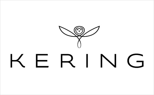
PPR, a French multinational holding company that owns and operates major fashion brands such as Gucci, Puma, Yves Saint Laurent, Alexander McQueen, Christopher Kane, Stella McCartney, JEANRICHARD, Qeelin and Sergio Rossi, is set to rebrand as Kering.
Creative agencies Dragon Rouge and Havas Lifestyle have been collectively involved in the rebranding process.
To further complement the publicity about the brand’s change of name and illustrate the message of the advertising film (below), the Group has sent Logo-Designer.co the following press release outlining the rationale behind the new identity design:
A name, an emblem, a signature Kering
The name Kering is pronounced "caring" and aims to encapsulate the way in which the Group aspires to look after its brands, its staff, its customers and its stakeholders.
The ending "-ing" is a reminder of the origins of the Group in the Brittany region of France; "ker" means hearth and home in the Breton language, reflecting the Group’s protective role in relation to its brands.
Effectively, this name affirms the global nature of a Group that is in touch with its roots and dedicated to developing its brands on an international scale.
The owl
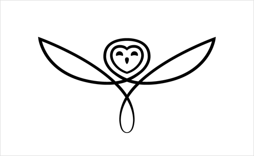
With its sharp vision and 270° swiveling radius of the head, the owl was chosen to represent Kering’s visionary character and foresight, its ability to anticipate trends and spot the potential in people and brands.
A protective and unobtrusive creature, the bird of the goddess Athena, it symbolises wisdom and intelligent activity.
Chinese variant
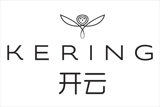
The Chinese name is Kering Kai Yun. Short and easy to say, “Kai Yun” is a name very close to "Kering", in both sound and meaning. Kai Yun refers to an open sky which leaves room for the possible and removes barriers to imagination and dreams – thus echoing the Group’s role and its signature, "Empowering Imagination". A synonym for good luck, “Kai Yun” also embraces a very positive connotation in China.
Logo

The Kering emblem consists of a stylised owl, placed over the stylised letters of the business name. Positioned so that its open wings appear to be lifting into the boundless realms of imagination. A moment in flight, to illustrate Kering’s lively minds and ability to anticipate trends.
Drawn with a single line, thick and thin, to embody our constant drive to excel ourselves, the Kering emblem has perfect symmetry to underscore the synergies needed to achieve our mission. The bird’s smiling eyes denote foresight, wisdom and intelligence. Finally, the owl’s face is framed by a heart to represent the attention, caring and respect that epitomise Kering’s human values.
The sans serif typography, with clear spacing between the letters, reinforces the feather-light quality of the emblem. The design combines the dynamic and gentle curves of Sport & Lifestyle with the finesse, balance and simple elegance of Luxury, to form, with the emblem, a statutory trademark set.
The signature
In both form and substance, the signature embodies the Group’s vision: to encourage the creativity and agility of its brands to enable them to go beyond their limits; to empower its brand managers and designers with the vision to deploy ambitious strategy, develop talent and fulfill their potential.
This signature is not rigidly confined to one graphic style, but adopts a number of different styles. All have been specially handwritten to embody the people-centred focus of the Kering Group.
"We worked with PPR on the central idea that was toset the tone for the new brand platform. 'Empowering imagination' emerged quite quickly after a series of interviews conducted inside and outside the Group. The managerial confidence placed in brand managers over day-to-day decisions and the central stimulus contributed by Group staff was perfectly reflected in the joining of these two words," explains Christian de Bergh, Managing Director of Dragon Rouge.
Graphic universe
The cornerstone of Kering visual identity is its emblem, the owl. A symbol of wisdom, the owl is a powerful bird, equipped to see in the dark. At dawn, after its night time exploration of rich and mysterious worlds, the owl returns with sources of inspiration to nourish the Group. In this way, Kering world revolves around black, dense and exciting, and around white, a blank canvas on which anything may be written. Day and night Kering puts imagination at the heart of everything it does.
With distinctive graphic codes, elevation, harmonies and shaded colours, a typography design and signature that reflects who we are, our new graphic identity conveys a specific style. Kering identity basics have been developed in a working drawing, to be used for both the Group and its brands. Open and transparent areas in the visual framework provide space for our brands to express themselves.
Black and white are the dominant colours of the Group universe. A range of colours based on soft, beneficial, warm light developed to offer a colour universe divided into four families: sunsets, azures, jades and fiery.
The Havas Lifestyle team adds: "This was a great opportunity for us to have been chosen to create the new visual identity of a group like Kering. Beyond this though, our team was passionate about creating an all-new creative world for the new brand. It is a very coherent world which is enhanced by the ‘Empowering Imagination’ signature, and conceived as a rich and dynamic ensemble of identity-defining codes that offer the required freedom and space of expression for imagination, which is at the heart of Kering."
The film
The film portrays the meaning of the new name and logo, in an emotional way, through a simple idea: ‘Imagination needs care and wings to become reality’.
It features a feather, from an owl. First, the feather watches over and takes care of talent and then it gives imagination the necessary impetus and force to take off. It represents the role that Kering plays with its brands, the mix of attention and energy that creates an environment that stimulates the imagination and enables ideas to become reality.
The film’s objective is to represent all spheres of the Group: Luxury and Sport & Lifestyle. And this, in an authentic way. For example, some athletes in partnership with our Sport & Lifestyle brands took part in making the film, like the skateboarder Jérémie Grynblat for Volcom and the French international footballer Olivier Giroud for Puma. A Girard-Perregaux master watchmaker also entered into the spirit and played his own character.
"A corporate brand, especially when it takes on a new identity, has to defend the idea of a unique and necessary brand to all stakeholders. ‘Imagination needs wings, imagination needs caring to become a reality’ is the story that Kering lives and breathes, a story which, moreover, links its symbols of identity," say Pierre-Yves Frelaux and Elisabeth Coutureau, President and Executive Vice-President of TBWACorporate.
Source: Kering


