Robot Food Rebrands Seabrook Crisps
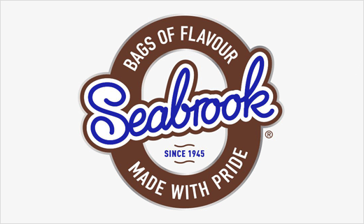
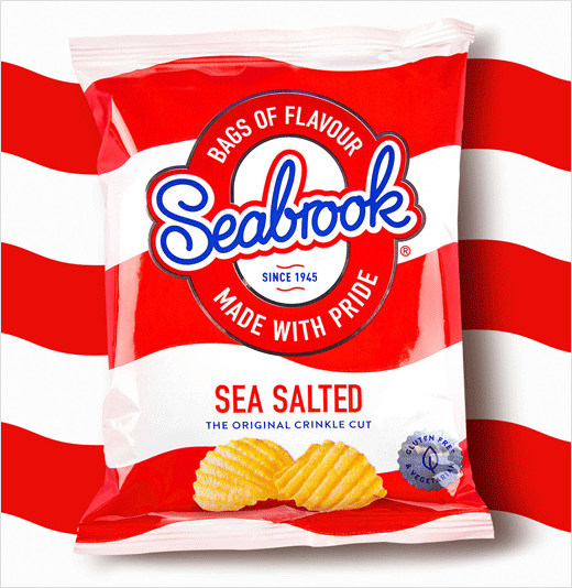
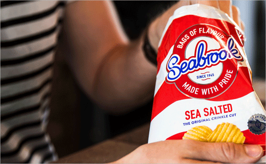
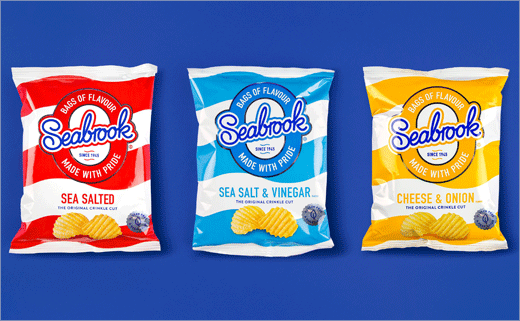
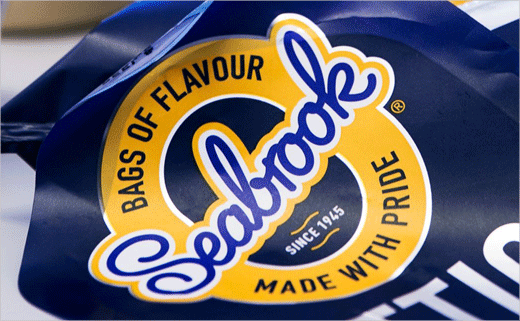
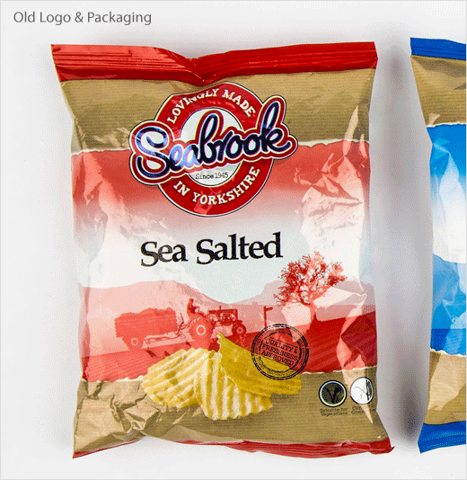
Robot Food has rebranded Seabrook Crisps, with the refresh including new packaging designs as well as a mildly retweaked logo.
Said to be the inventors of the crinkle-cut and the first crisp manufacturer to use sunflower oil, the Bradford-based brand tasked Robot Food to redesign its Crinkle, Lattice and Straight Cut ranges.
"Seabrook has an enviable heritage, holding cult status to legions of loyal fans. In an overcrowded, hyper-mature crisp category, it was time to stand out rather than blend in. The challenge was set to improve sales by increasing penetration both inside and outside their consumer heartland, and build brand value in a category driven by price and promotion," says Robot Food.
The core range redesign features thick stripes of variant-appropriate colours, undulating for Crinkles and straight-edged for Straight Cut. The designs are set against a white background, a key Seabrook brand equity.
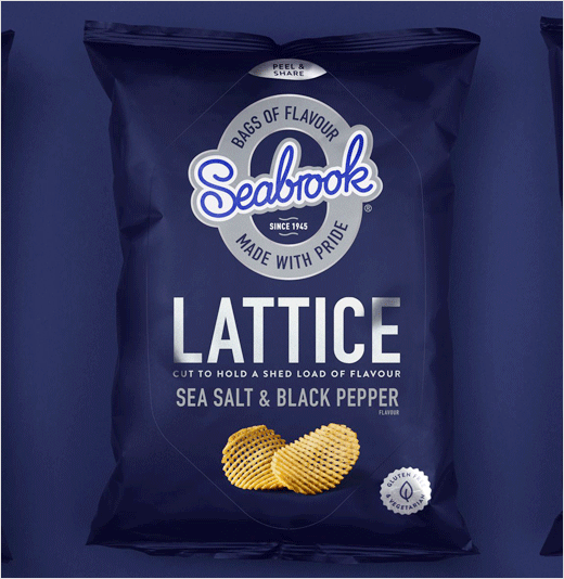
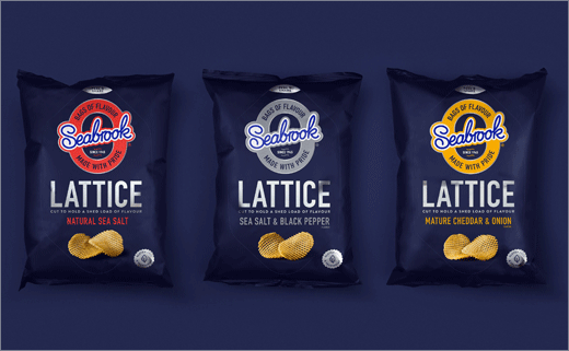
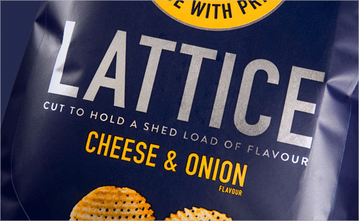
For the more 'premium' Lattice range, Robot Food's designers chose a blue backdrop and a foil substrate to give each flavour’s accent colour additional standout.
The team also created a new tone of voice, including the ‘Bags of flavour made with pride’ strapline and the ‘Saviours of flavour’ brand story, which nods to Seabrook's northern roots.
"We smashed category rules to give Seabrook a much braver, more disruptive attitude. No more clutter, just big bold ‘look at me’ branding. Seabrook is now more relevant, without being mainstream in approach," claims Martin Widdowfield, design director of Robot Food.
The new branding is set to launch this month in stores across the UK.
Robot Food
www.robot-food.com


