Robot Food Unveils New Logo and Packaging Design for Bulk
Leeds-based creative agency Robot Food has rebranded online sports nutrition company bulk – for the third time.
With the business reportedly set to break £100m revenue in 2021, the strategic reposition and rebrand is designed to broaden the company's appeal beyond its current customer base of avid gym-goers. Hence the decision to drop ‘Powders’ from the business name.
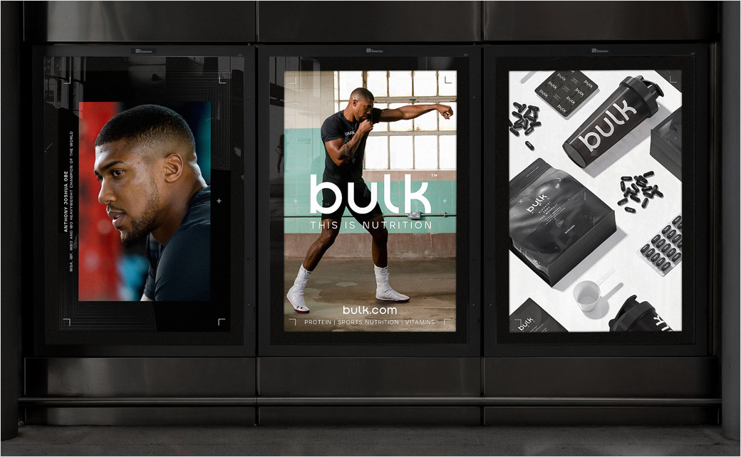
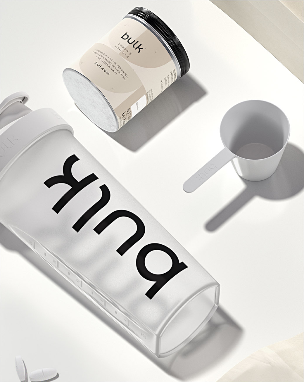
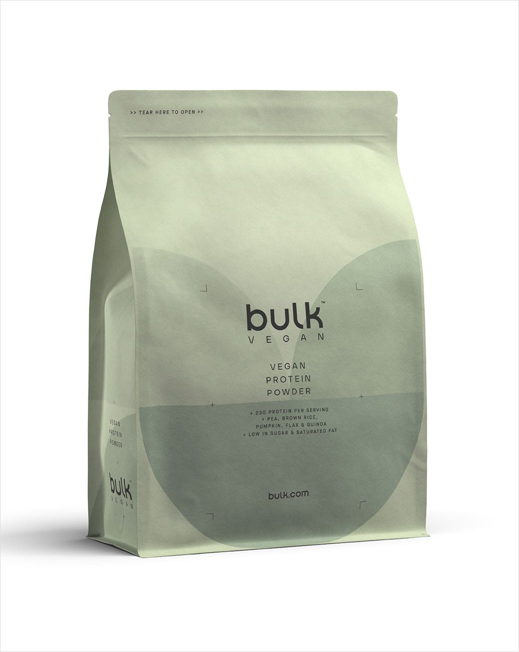
Robot Food says it chose to break away from the confines of the category, opting instead to "create a clean, confident and consistent identity" that takes inspiration from "lifestyle fashion and contemporary health and beauty brands".
The challenge was to strike the balance between the needs of both existing and potential bulk customers.
"A common theme between the two audiences was the importance of the fitness ‘journey’. From this came a strong reason to believe; that no matter who you are, if you have a goal, bulk can help you achieve it," explains the design team.
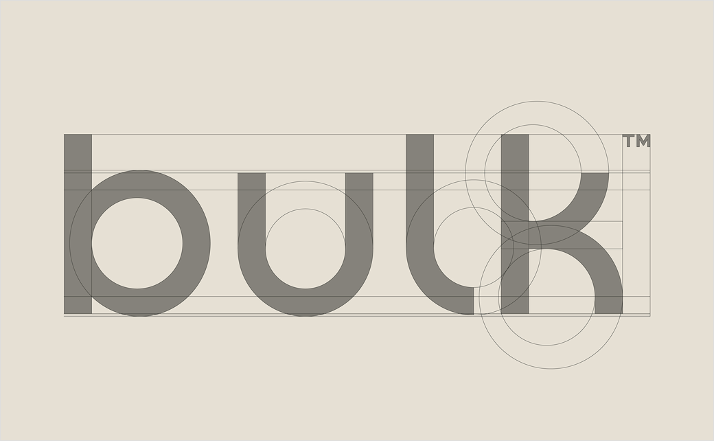
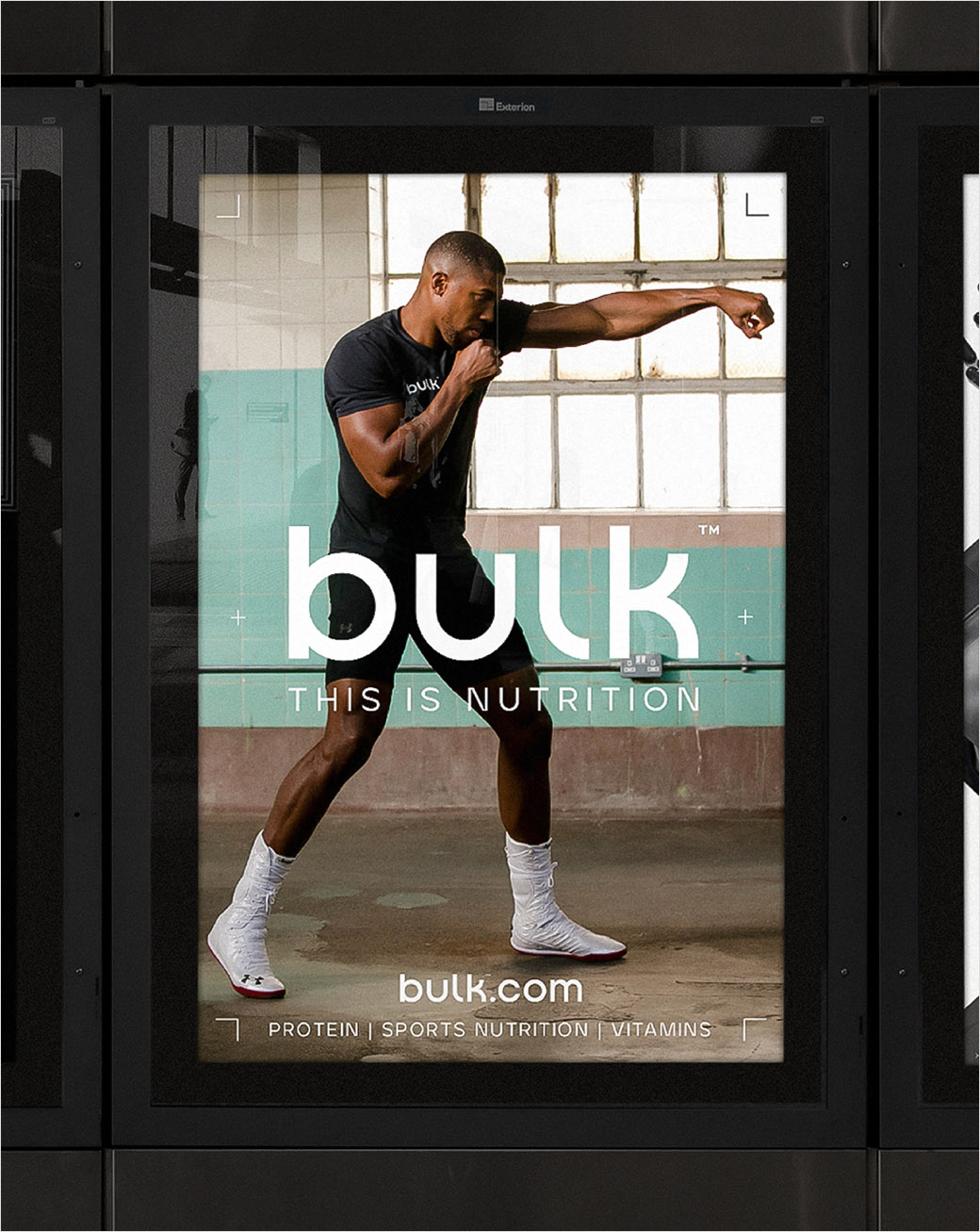
For the visual identity the designers chose to soften the connotations of the word ‘bulk’ with a new lowercase wordmark, created in-house and then tweaked by Paul Hutchison of Los Angeles-based Hype Type.
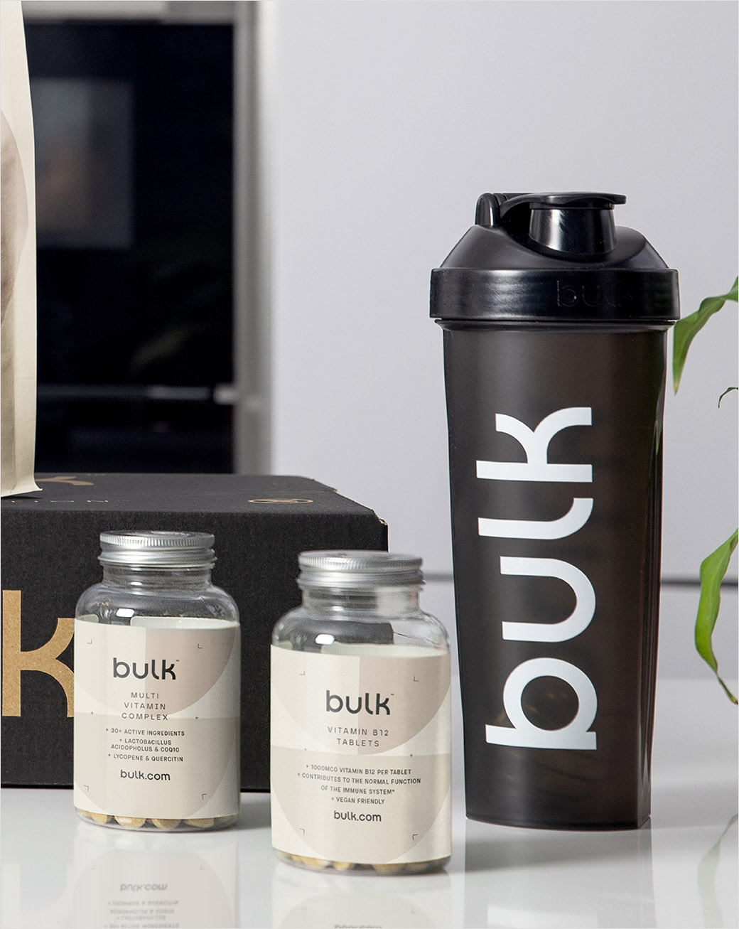
Alongside the wordmark, the identity also includes the bespoke font suite ‘Bulk Sans’, a custom variation of ‘Aventa’ created with input from Ellen Luff Type Foundry.
"The technical cuts and visual variances of the font add an ownable, technical edge to the identity and act as the lead choice for brand messaging to bolster a newly defined, confident and motivational tone of voice," say the designers
"To pull bulk apart from other active nutrition brands, we needed to adopt a ‘less is more’ approach in a category where more is usually more – whilst allowing for enough flex in the design to clearly differentiate the ranges," comments Ben Brears, strategic design director at Robot Food.
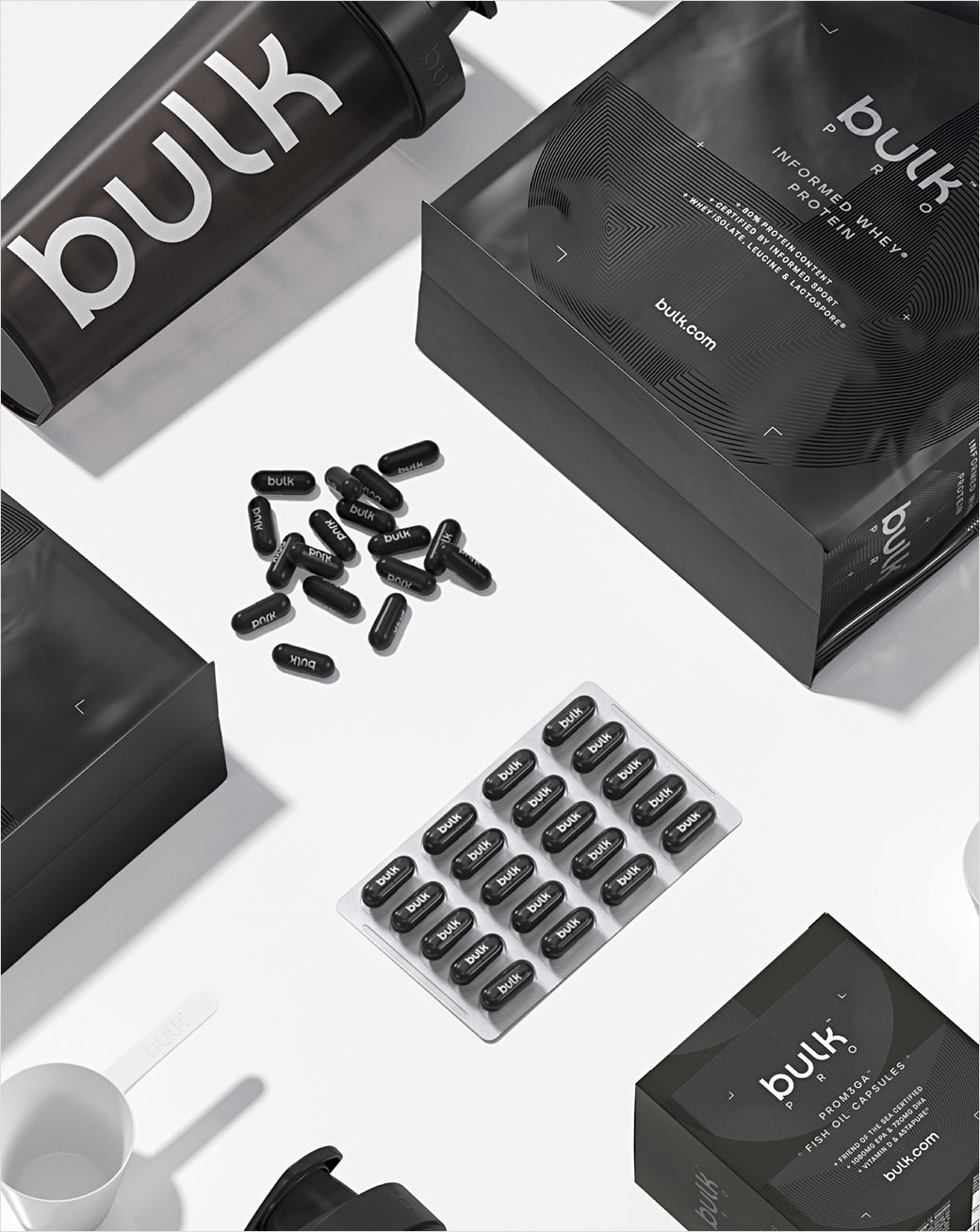
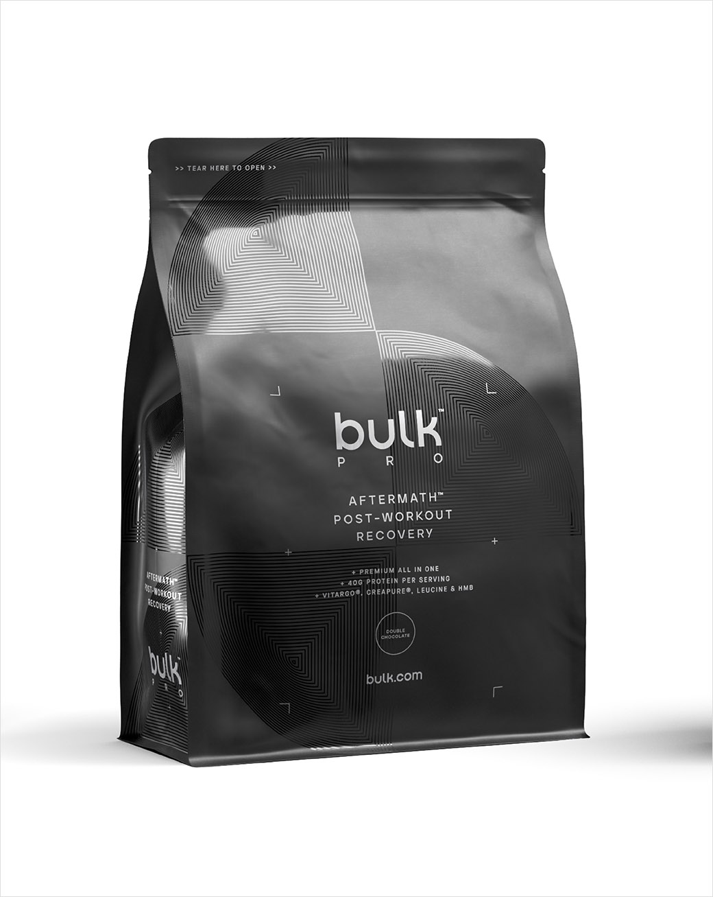
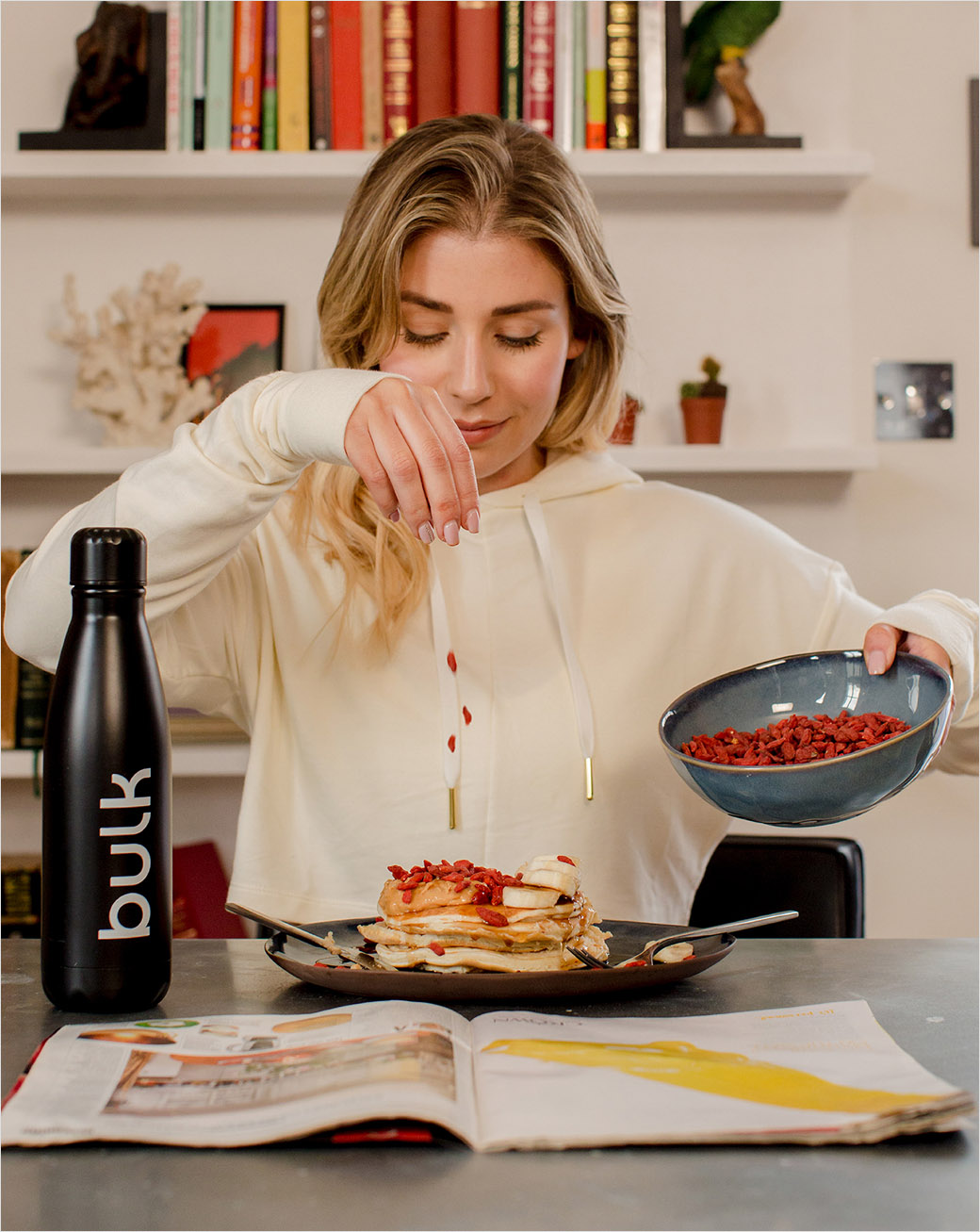
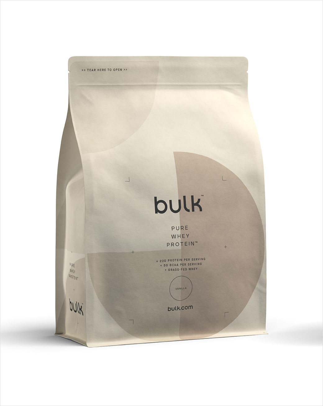
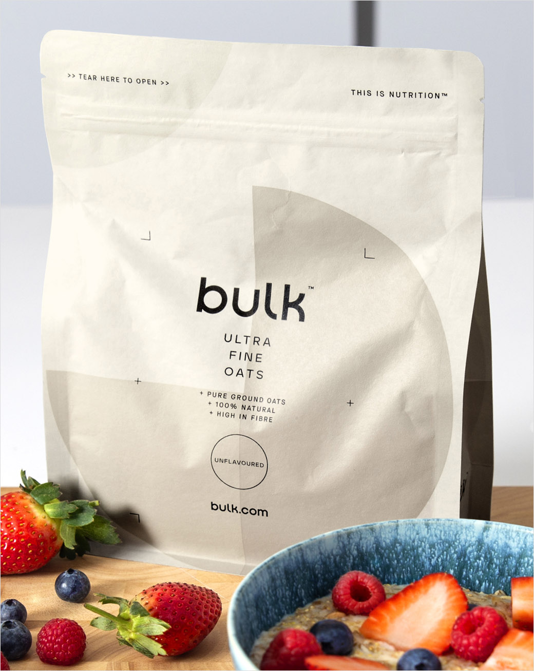
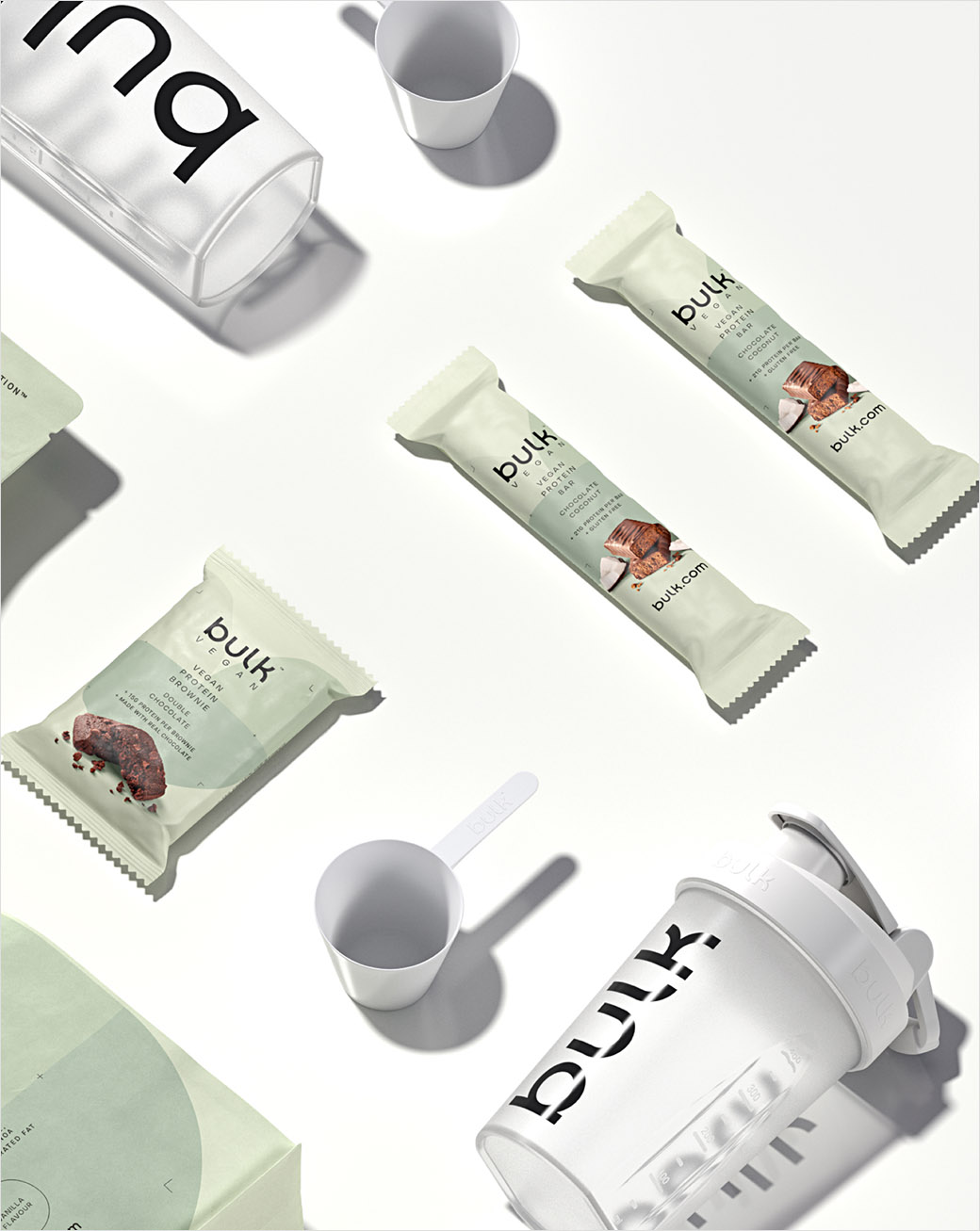
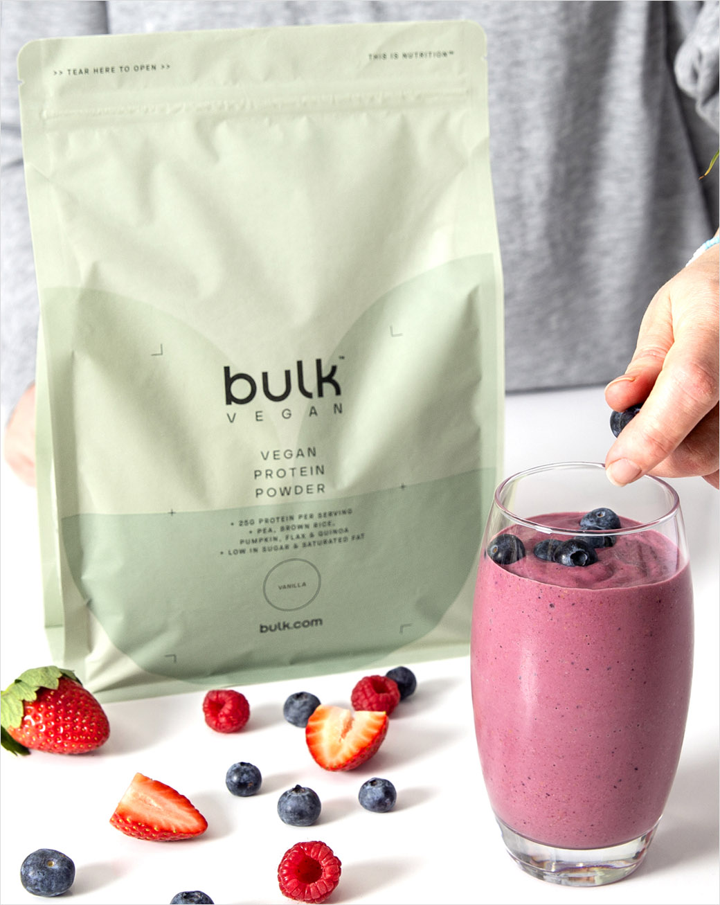
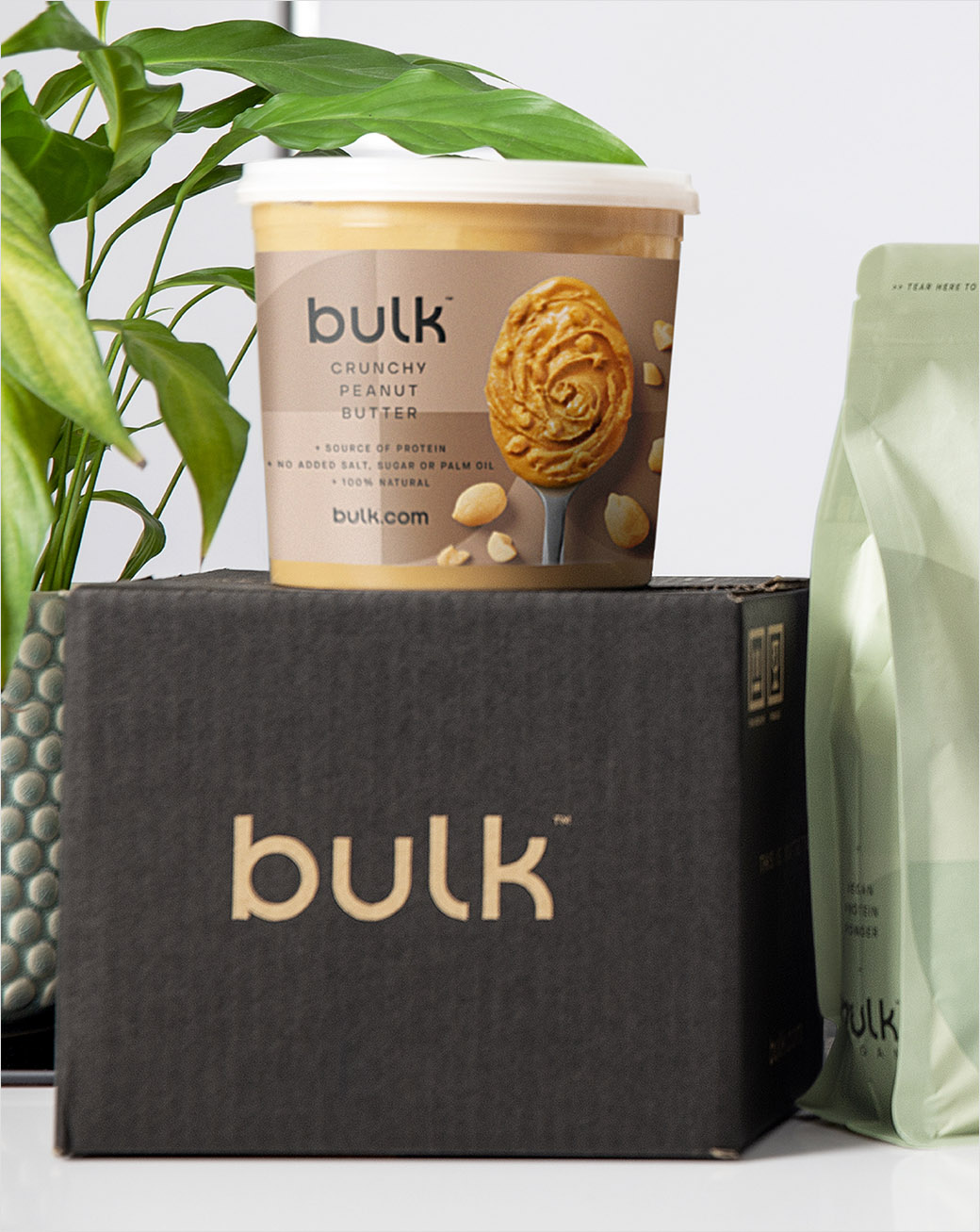
Adding: "To achieve this, we created a number of circular patterns, reminiscent of nutritional charts, that would be unique to each range, and chose different colours and finishes to add a depth and ownability to the identity. For bulk PRO we opted for tactile print finishes and textures to signify its premium positioning. Whilst the former ‘Active Foods’ now includes photography for a much foodier feel."
An additional aspect of the brand’s repositioning is a renewed focus on sustainability; 95% of capsule and tablet packaging is now plastic-free, along with 93% of product pouches, which are also home-compostable. These decisions are part of the company’s wider pledge to become a completely plastic-free business.
“With a complete change in appearance, comes a renewed energy and focus on creating a more inclusive experience for our customers, as well as a more sustainable brand for our planet. Health is more than protein shakes and vitamins, so we needed to take a more holistic approach – enabling our customers feel good and live well," explains bulk co-founder, Elliot Dawes.

Robot Food
www.robot-food.com


