• rss
  • pinterest
  • twitter
  • facebook
  • inkedin
Logo Designer menu
  • home
  • home
  • about
  • advertise
  • contact
  • submit
  • jobs
  • Advertising
  • Advice
  • Architecture
  • Articles
  • Arts
  • Automotive
  • Books
  • Business & Finance
  • Communication
  • Community
  • Competition
  • Computer & Internet
  • Corporate
  • Design
  • Design Jobs
  • Design Studio
  • Design Tools
  • Education
  • Electronics
  • Entertainment
  • Fashion & Lifestyle
  • Fonts
  • Food
  • Freight & Transport
  • Government
  • Health & Beauty
  • Home & Garden
  • Hotel & Travel
  • Icons
  • Music
  • News & Media
  • Opinion
  • Other
  • Photography
  • Real Estate
  • Religion & Spirituality
  • Science & Technology
  • Social & People
  • Sports
  • TV & Video
  • Web Design
  • pinterest
  • twitter
  • facebook
  • inkedin
search
0

Sheridan&Co Creates New Brand Identity for KIN Nutrition

By Editor February 16, 2017

Categories: Food, Health & Beauty

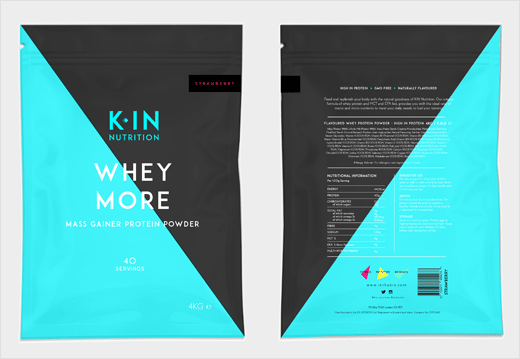
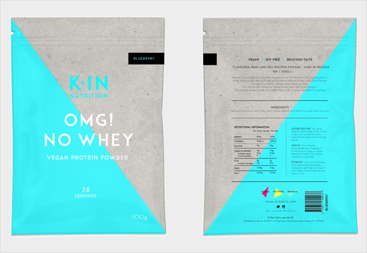
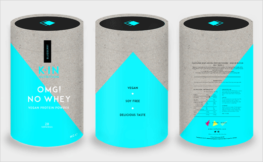
Global retail design agency Sheridan&Co has created the new brand identity for KIN – a range of premium nutritional supplements developed by fitness experts Kyle and Kelly Maslen, otherwise known collectively as KMPT.

With a combined 17 years of industry experience, Kyle has trained GB athletes, industry execs and celebrities, while Kelly’s expertise lies in yoga; together, they run luxury fitness retreats in Ibiza that encompass both exercise and nutrition.

To facilitate the business’ future growth – particularly within its own line of nutritional supplements that include protein powders, fish oil capsules and powdered super greens – KMPT sought a brand overhaul that would communicate the two personalities behind the brand as well as deliver standout on shelf.

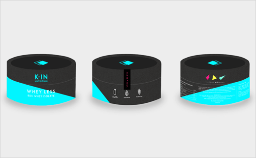
Sheridan&Co were therefore tasked with renaming KMPT’s nutritional supplements product line and redesigning the logo and product packaging.

“Playing on the kindred relationship between Kyle and Kelly and sense of a kindred community – a familial connection, if you will – between PT and client that underscores their unique and personable approach to training, the brand name KIN was conceived,” explain the designers.

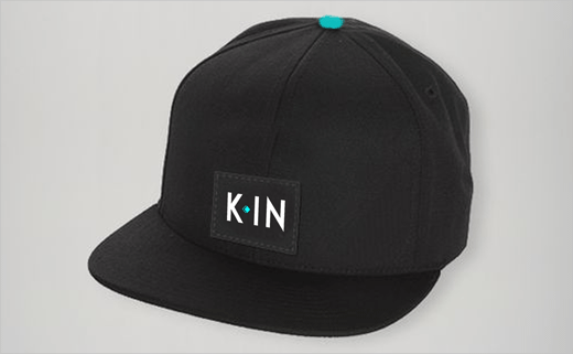
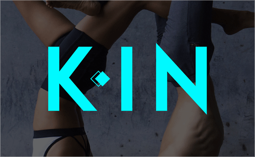
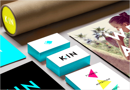
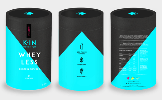
“The logo was next developed to bring this line of thinking visually to life. Using a strong, stripped back monochrome palette offset by blue Pantone, the subtle spatial play that sees the upper case ‘K’ slightly separated from ‘IN’ divided by a double diamond icon, represents the dual personalities of the brand’s founders.”

Building on the diamond brand marque that features in the logo design, the Sheridan&Co design team introduced a further three luminous coloured deconstructed triangular shapes in the brand identity that nods to the master diamond design.

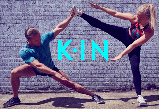
This visual language was subsequently applied to KIN’s marketing collateral, which includes the logo being transposed onto lifestyle photography of people exercising in either an urban or natural setting.

“On shelf, bold masculine-centric labelling fails to communicate meaningfully to a wider and more diverse health conscious consumer audience. On shelf, this translates into a brash cacophony of angry fonts and a clamour of colour; brand differentiation gets lost within this visual noise,” says Michael Sheridan, CEO of Sheridan&Co. “The design we develop for KIN goes against the grain; its boldness lies in its vey minimalist aesthetic. It is genderless in composition, therefore instantly more inclusive. The vibrant abstract design is cleaner and edgier – making it instantly more impactful on shelf. We took our visual cues from luxury confectionery brands to infer the premium quality of the ingredients used in the product.”
Sheridan&Co
www.sheridanandco.com

Tags: abstract, diamond, exercise, geometric, identity design, K, Kelly Maslen, KIN, KMPT, logo design, logotype, Michael Sheridan, minimalist, naming, neon, packaging design, retail, Sheridan&Co, triangle, whey protein

SEE ALSO:

  • Brand Identity: Strong Nutrients by Pearlfisher
  • Pearlfisher Creates ‘Experiential’ Brand Identity for Cadbury
  • Dragon Rouge Creates ‘Heavenly’ Sub-Brand for Danone
  • CBA Creates New Brand Identity for Fragrance House, Jean Niel
  • Studio Blackburn Creates Brand Identity for OPC Distribution
  • Pearlfisher Creates New Look for Fragrance Brand, Jo Loves

Leave a Reply

Click here to cancel reply.

CATEGORIES

  • Advertising
  • Advice
  • Architecture
  • Articles
  • Arts
  • Automotive
  • Books
  • Business & Finance
  • Communication
  • Community
  • Competition
  • Computer & Internet
  • Corporate
  • Design
  • Design Jobs
  • Design Studio
  • Design Tools
  • Education
  • Electronics
  • Entertainment
  • Fashion & Lifestyle
  • Fonts
  • Food
  • Freight & Transport
  • Government
  • Health & Beauty
  • Home & Garden
  • Hotel & Travel
  • Icons
  • Music
  • News & Media
  • Opinion
  • Other
  • Photography
  • Real Estate
  • Religion & Spirituality
  • Science & Technology
  • Social & People
  • Sports
  • TV & Video
  • Web Design

POPULAR

  • P&W Updates Logo and Packaging Design for Organic Food Brand – RIFCo
  • Lewis Moberly Designs Dyslexia-Friendly Typeface for Tropic Skincare
  • Bonaventure’s Luxury Lifestyle Product Aura Gets New Name and Logo
  • Payments Processor, Yapstone, Unveils New Logo Design
  • Honda Announces Name and Logo of New SUV Model
  • Cathedral City Launches New Logo and Packaging Designed by BrandOpus
  • Apparel Brand Outway Unveils New Logo and Identity
  • HR Analytics Software ChartHop Reveals New Logo Design
  • Tech Site CNET Rebrands, Unveils New Logo Design

TAG CLOUD

3D A animated logo architecture black black and white blue branding car badge circle fruit geometric gold green grey icon design identity identity design illustration interior design leaf logo design logotype luxury M minimalist monochrome monogram naming orange packaging design Pentagram pink poster design purple rebranding red roundel shield stationery design stripes typography web design wordmark yellow

MONTHLY ARCHIVE

tweet meme

Tweets by @logodesigner_co

facebook

  • ABOUT | ADVERTISE | CONTACT
  • SUBMIT YOUR WORK

We simply love logos! Logo-Designer.co is dedicated to corporate and brand identity work. Our primary goal is to showcase identity design from around the world; we want to give designers the opportunity to share and publicise their creative work online.

If you're a designer wanting to submit your work, click on the ‘SUBMIT YOUR WORK' tab above.

For all other enquires, including advertising placements, please complete this form:

*Required Fields

THANKS. YOUR MESSAGE HAS BEEN SENT.
WE'LL RESPOND SHORTLY.

Logo-Designer.co is an online platform open to both professionals and students. We’re interested in your logo’s ‘design story’ – context, history, background, ideation, narrative, symbolism, meaning, semiotics, and other such things. We want to see iterative sketches, including discarded preliminary and prefinal designs, wherever possible. If you’re able to tell us about budget and time constraints, please do so. The more information, the better.

WHAT YOU NEED TO DO:

  • Provide large-sized images showing your design in lots of detail, saved at 150 or 300 dpi in JPEG (preferred) or PNG format
  • Include the ‘design story’ text document, not forgetting to list relevant categories and tags
  • Enclose the above in a single zip/rar file and send to: submissions [at] logo-designer [dot] co
  • You can submit more than one logo design; however, the limit is one submission per month
  • Be patient (it may be a while before we feature or publish your work).

OTHER CONTENT:

As well as logos, we’ll also consider the following for publication:

  • Font design
  • Icon design
  • Articles: opinion/advice (from both logo designers and brand strategy consultants).

RULES:

Please note: Logo-Designer.co will not show work related to any of the following:

  • Alcohol
  • Gambling
  • Tobacco
  • Pornography (or adult related themes).

©2020 Logo-Designer.co. All rights Reserved.
Do not republish/reprint our content without express written permission.
You are free to link to any of our website material.