SomeOne Creates New Logo and Identity for Maplin Electronics

SomeOne has created a new the brand strategy and identity for Maplin, the electronics retailer with 217 stores across the UK.
Maplin identified that they needed a new brand identity in order to connect with new customers while not alienating their existing consumer base.
"Today they face increasing competition from the availability of cheap electronic components and peripherals online," says SomeOne. "As a result, Maplin needed to move on from being known just as an electronics specialist to be a more inclusive multi-channel technology retailer offering broader services."
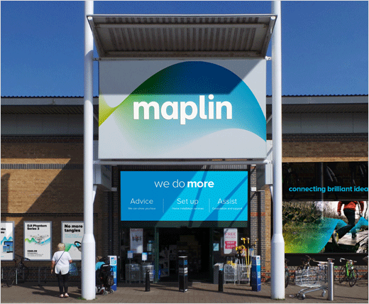
"When it came to the visual identity, the brief called for an ‘evolutionary and transitionary’ approach, providing input for Maplin’s ‘Store of the future’ concept stores," explain the designers. "We helped incrementally improve the design of the word mark with screen-friendly kerning and detailing. We also scrapped the impersonal DIN corporate typeface in favour of a new, friendlier Proxima Nova."
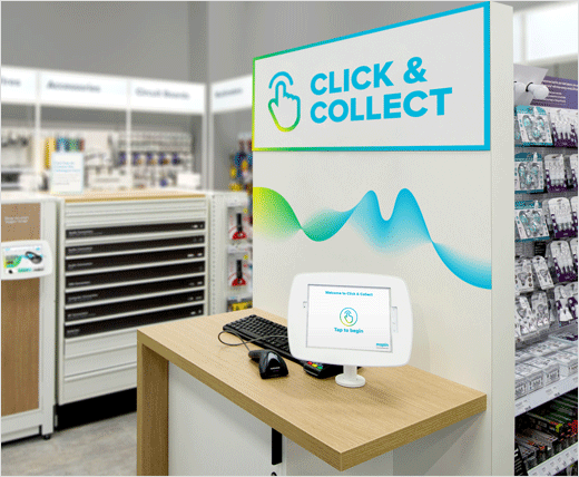
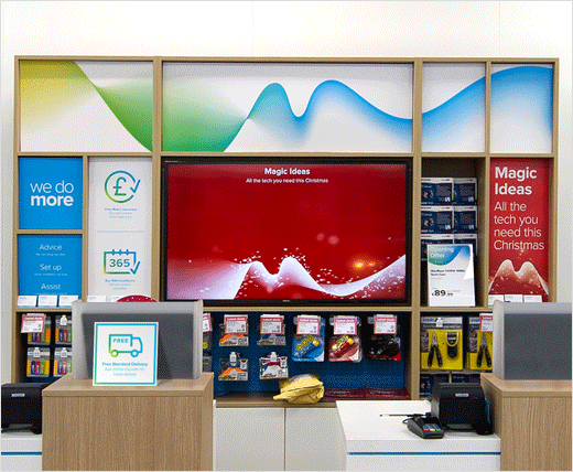
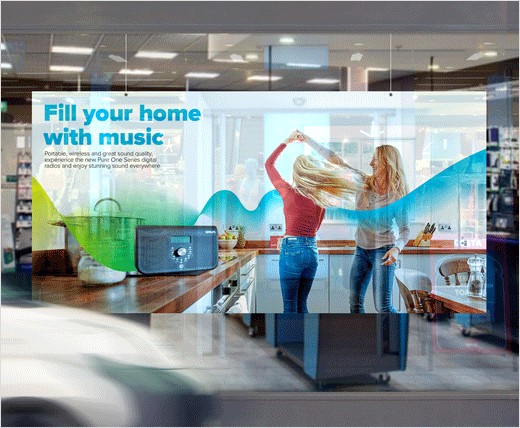
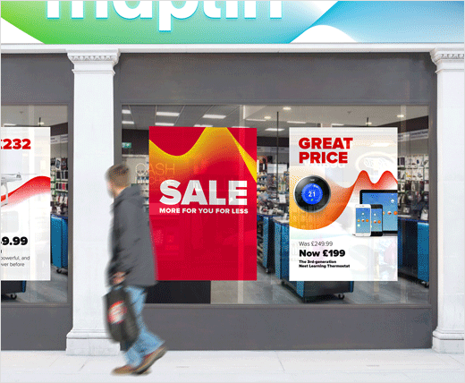
Another key design element is the new Maplin ‘wave’ – a constantly moving and evolving graphic property that senior designer Helen Altoungarian says represents the "ease and fluidity" of Maplin’s service and technology.
"This helped the communications flex and adapt for seasons and product ranges with the use of colour," she adds.
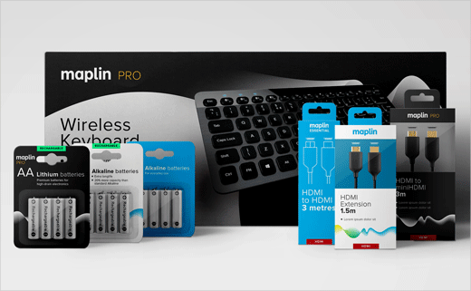
In total, the rebrand covers brand strategy, brand architecture and visual identity. The agency has also advised on uniforms, product and lifestyle photography, as well as motion graphics, signage and own label packaging guidelines covering hundreds of products.
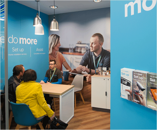
The new brand identity is initially being tested in two concept stores and in some key communications, with full UK rollout expected over the coming year.




SomeOne
www.someoneinlondon.com


