The Click Refreshes Branding for Historic UK Department Store – Jarrolds

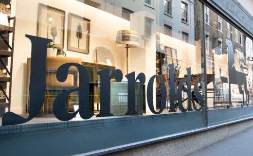
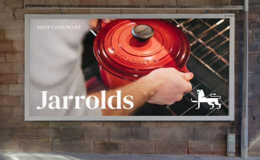
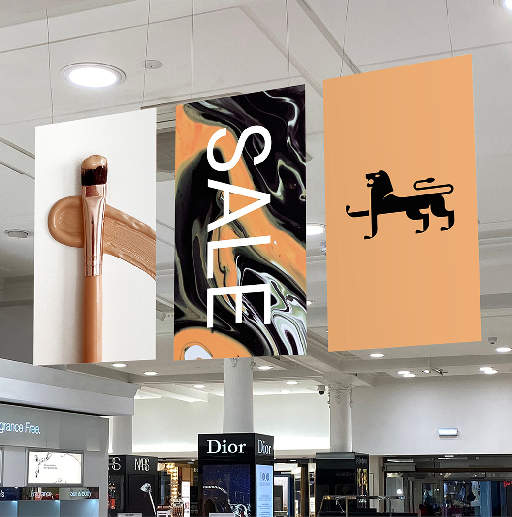
Branding agency The Click has modernised the logo and identity of historic British retail store, Jarrolds.
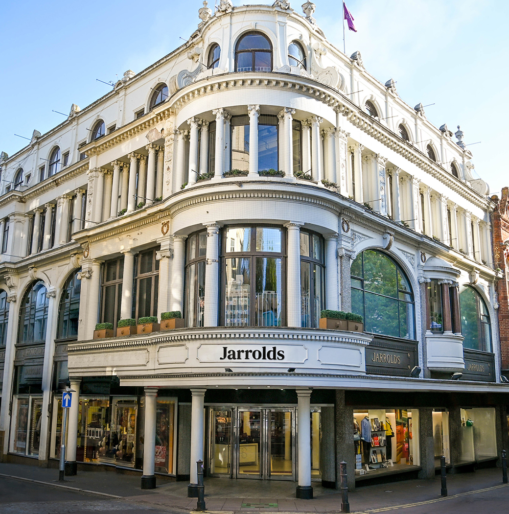
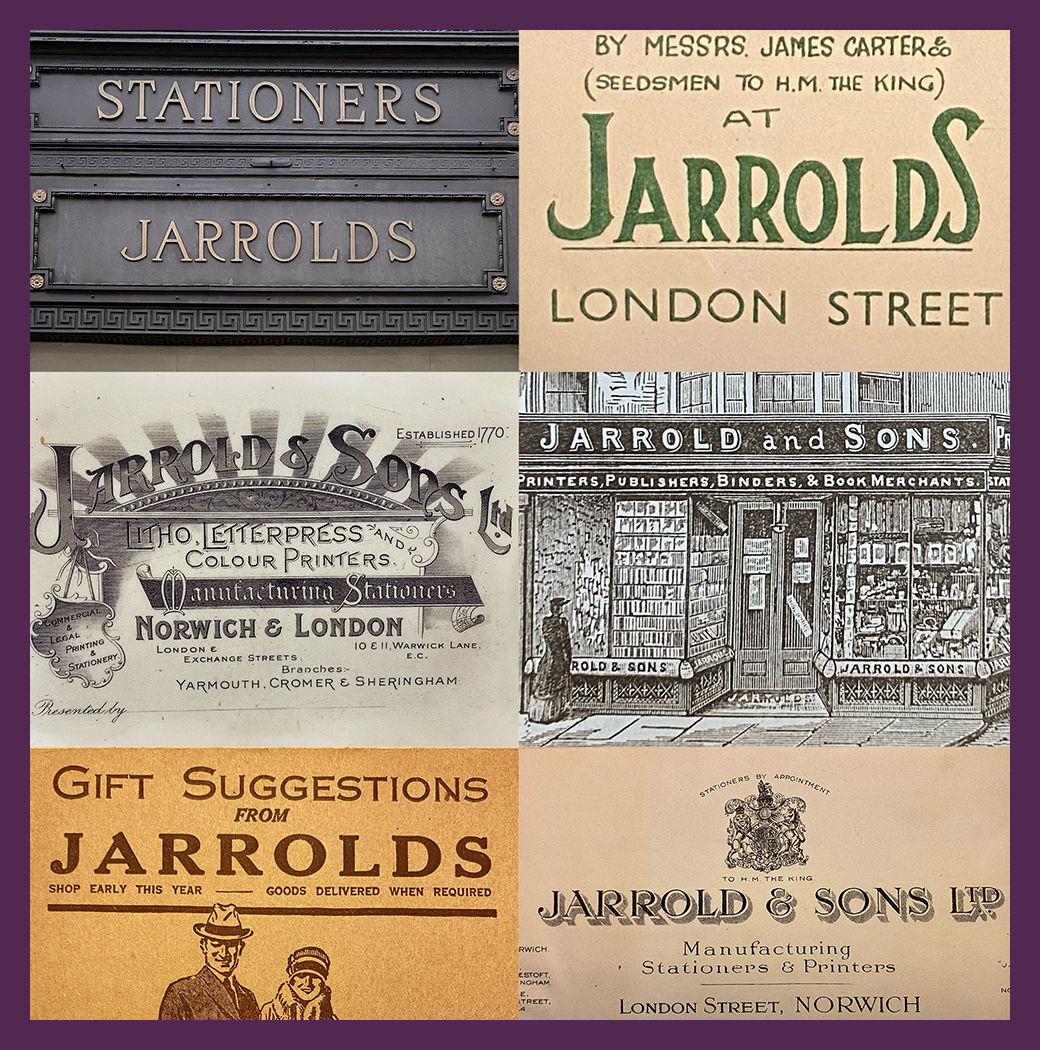
Founded in 1770 by a then 25 year-old John Jarrold, the family-run business currently encompasses six stores located across Norwich.
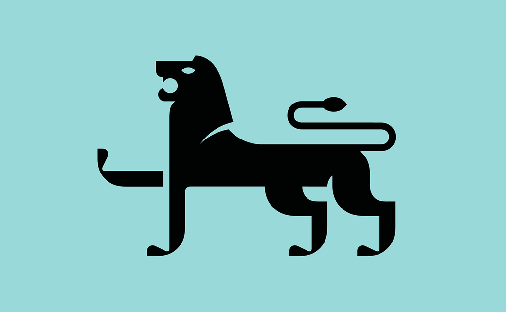
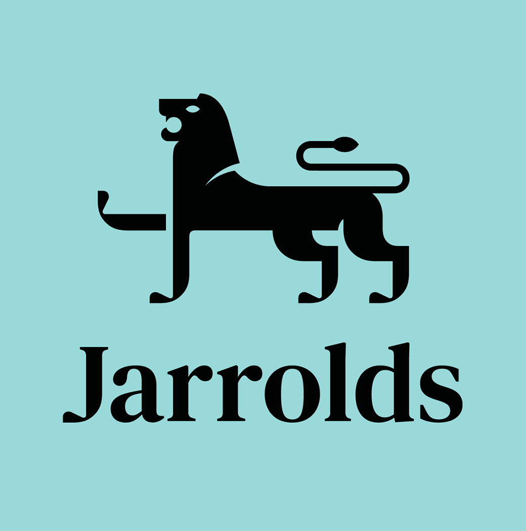
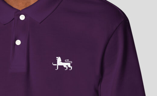
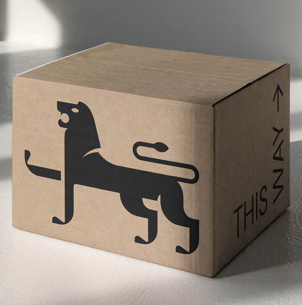
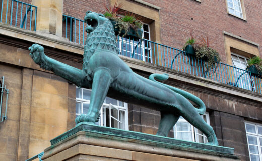
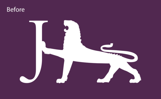
Over 50 years ago, Jarrolds decided to incorporate a lion into their logo, being inspired by a pair of heraldic lions that were designed by sculptor Alfred Hardman to mark the official opening of Norwich City Hall in 1938.
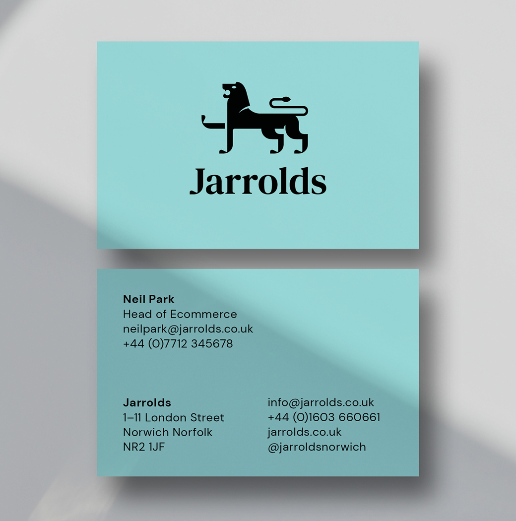
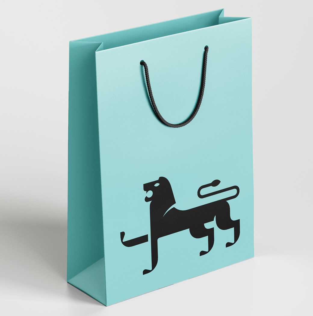
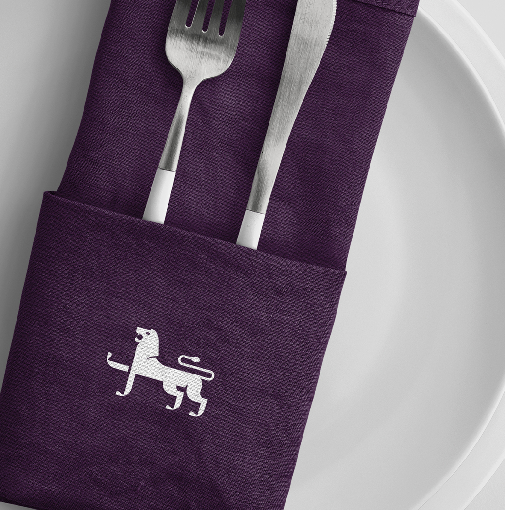
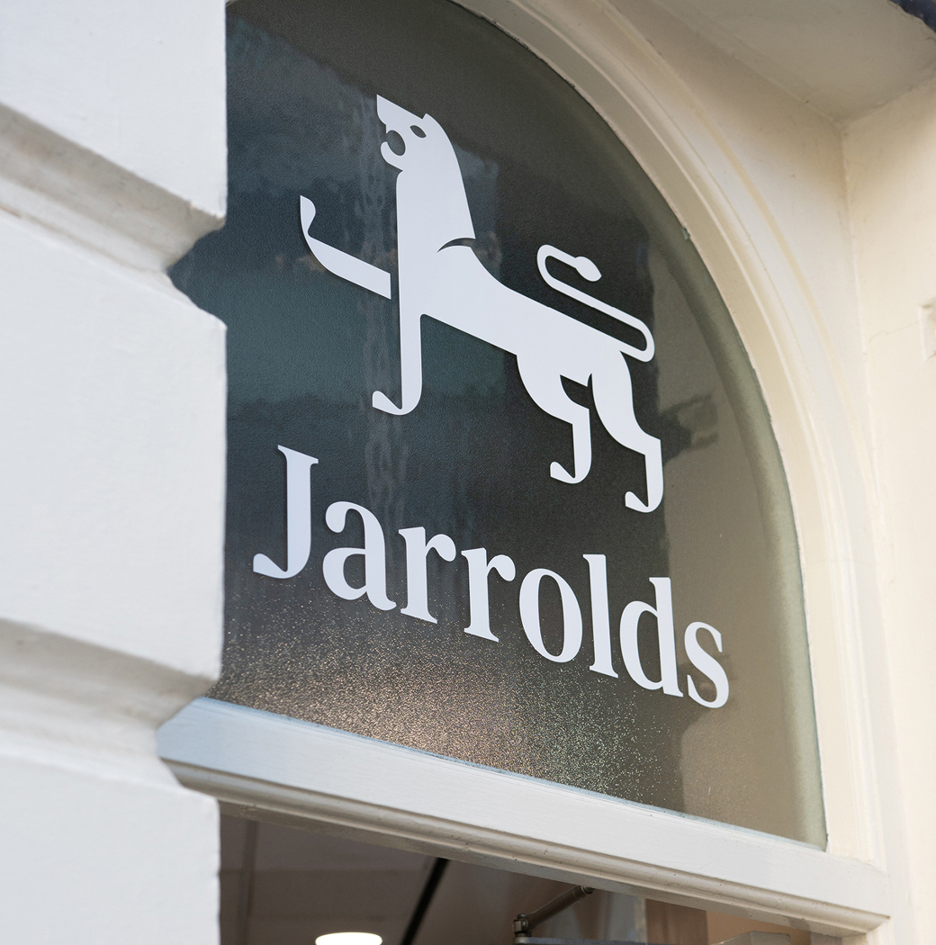
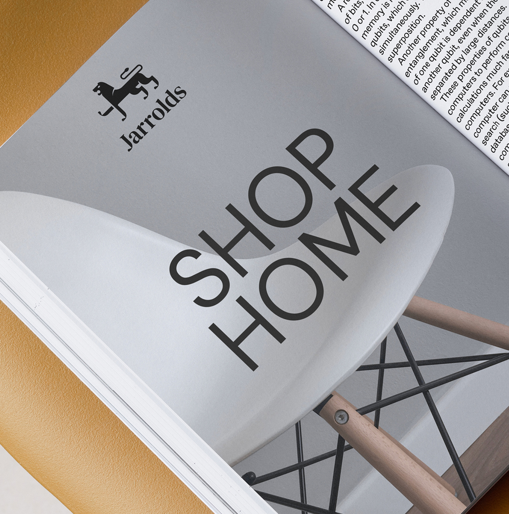
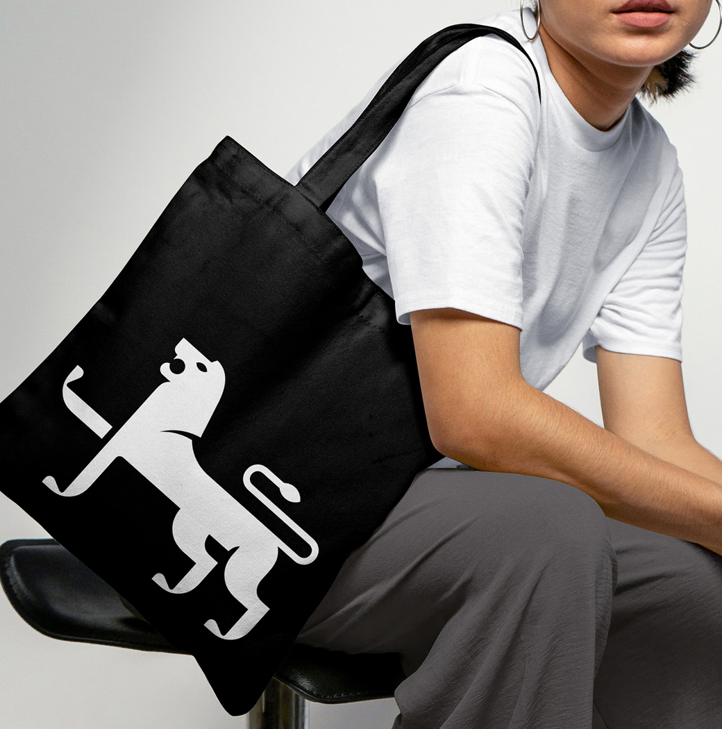
"The debate of whether to retain the lion did come up during our creative process, however, we quickly realised the huge amount of brand equity the lion contributed. As such, we decided to search for a clever way to give it a new and more meaningful lease of life by integrating the ‘J’ for Jarrolds into the lion itself," explains Adam Ewels, design director at The Click.
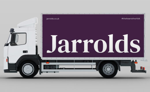
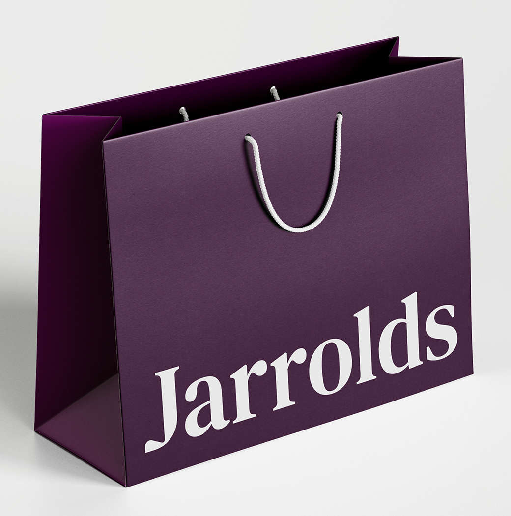
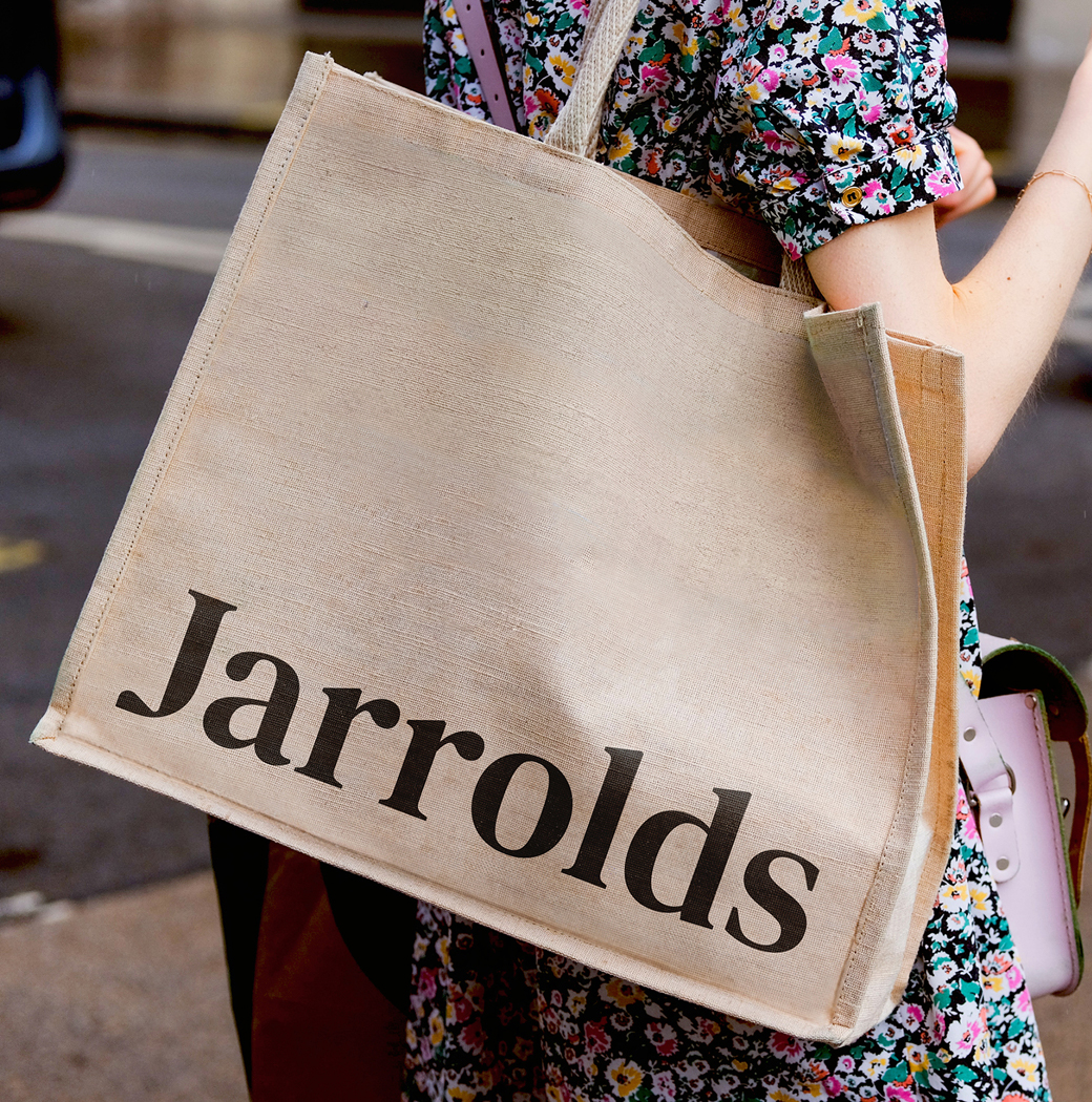
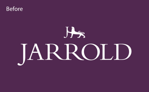
"Another significant addition to this new branding is the infamous ‘s’. Over their 250 year history, Jarrolds have never quite decided on whether to be Jarrold or Jarrolds. We have deliberately reintroduced the ‘s’ based on a range of factors," further explains the design team.
Adding: "Whilst Jarrolds was founded by John Jarrold, it later became Jarrold & Sons and, eventually, there would be eight generations (and counting!) of the Jarrold family. As such, we felt it important to pluralise the name once and for all. Jarrolds not only sounds more friendly, but it’s what people call the business in any case."
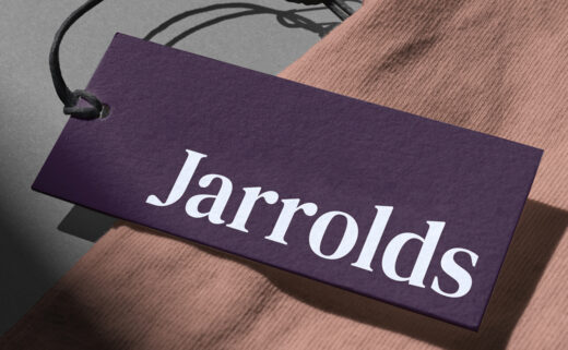
Like the lion mark, the company's existing purple and blue brand colours have been retained but updated.
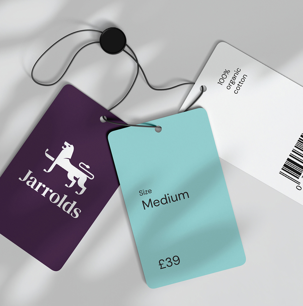
"The Jarrolds Purple is derived from all things luxury and Verdigris Blue pays tribute to the bronze lion statues discoloured by atmospheric oxidation. Previously, the two colours were often used together, however, moving forward, they will strictly be used separately from one another – the Jarrolds Purple will form the background to white and the Verdigris Blue is paired with black," say the designers.
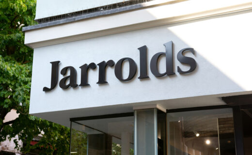
The new look also sees the introduction of two brand typefaces; a 'luxury' serif in the form of Lapture that is then paired with a 'modern' sans-serif, namely, DM Sans.
The Click
www.theclickdesign.com


