Harmony Extracts Turns to Pentagram for New Look
Pentagram has created the identity and packaging for Harmony Extracts, a new cannabis business based in Denver, Colorado, which is one of the nearly 30 U.S. states where marijuana has now been legalised.
During the preliminary research phase of the project, Pentagram’s designers even travelled to Denver to survey several marijuana dispensaries.
“Half of the dispensaries observed by the Pentagram team looked like the typical ‘head-shops’ of days gone by – small, dimly lit dens crammed full of amateur, overly colourful packaging that would fit comfortably in High-Times magazine,” says the agency. “But a few of the dispensaries the designers visited were modern, clean and well-considered spaces that seemed to be on a mission to become the Starbucks of the cannabis retail world.”
The Pentagram team therefore came away from the ‘tour’ with a goal to position Harmony Extracts visually as a modern, high-end brand in order to establish its niche in the rapidly evolving cannabis retail market.
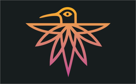
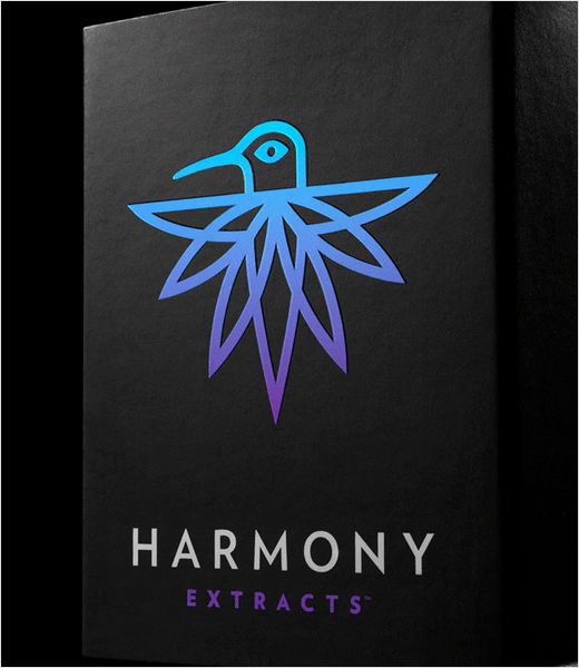
Early in their brand identity explorations, the design team then landed on the idea of using an image of a hummingbird, with distinctive marijuana-leaf shaped tail feathers, as the symbol for Harmony and its line of extracts.
“A hummingbird, ‘nature’s little extractor,’ is an energetic, participant in the natural ecosystem and seemed to be the perfect symbol for the new company,” explain the designers.
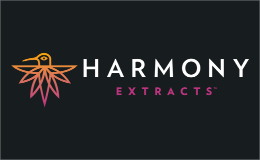
The resulting “Harmony Hummingbird” icon was paired up with the typeface Verlag to complete the main identity lockup for the brand.
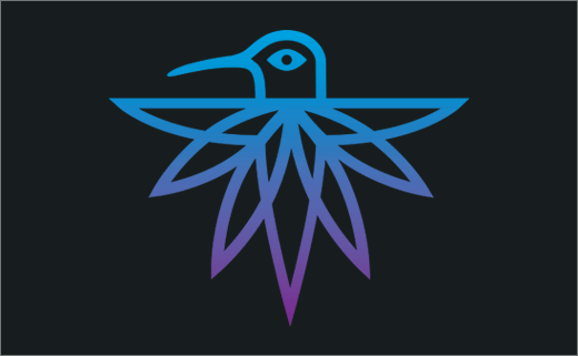
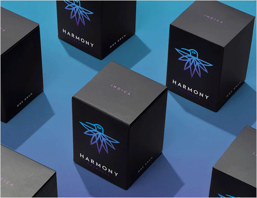
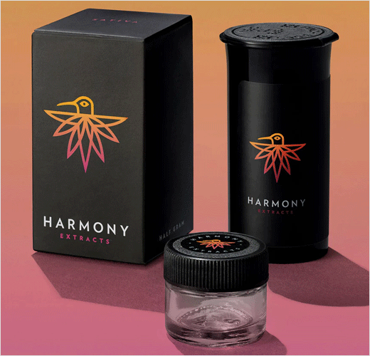
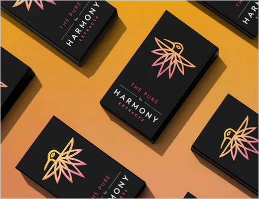
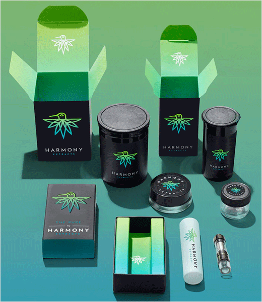
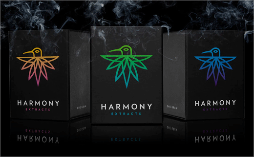
The designers further organised Harmony’s products into three main strains of cannabis, namely, “sativa”, “indica”, and “hybrid”. Each of the three strains was assigned a colour indicator based on their “mood generating profile”. For example, a warm, energetic magenta/orange hummingbird logo is used in the packaging scheme to indicate the sativa strain and a cooler blue/purple range for indica. A yellow/green bird, meanwhile, represents the hybrid strain and is used as the main colour for the Harmony Extracts brand.
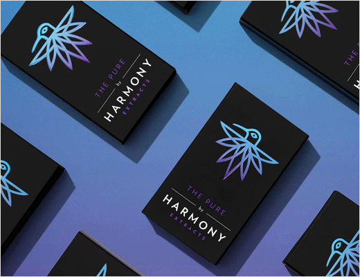
The different coloured hummingbirds are then positioned against a black packaging scheme printed with matte ink and finished with a “soft-touch” coating. The interiors of the boxes and other containers pick up the colour ranges of the three strains.
Pentagram
www.pentagram.com


