SEAT Unveils New Logo in Paris
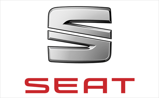
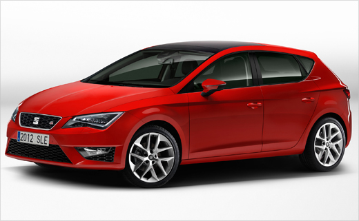
SEAT has officially unveiled its new logo at the 2012 Paris Motor Show this morning, alongside the introduction of the all-new Leon.
The new corporate identity marks the beginning of a new era for SEAT, and comes as the company attempts a new product offensive that has included the premieres of the Mii city car and Toledo hatchback, and the introduction of the revised Ibiza.
James Muir, president of SEAT, presented the new car and the logo during SEAT’s Paris show press presentation this morning.
“The next step in SEAT’s evolution is the presentation of our new company logo. It reflects those brand values I just mentioned: clean, pure design and precise, quality engineering,” he said.
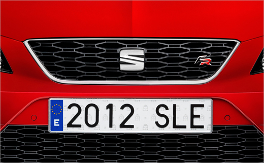
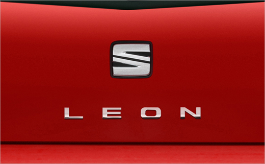
The first model to wear the new logo will be the all-new Leon, the company’s Paris show main feature.
“It is an icon in our range and it represents the very best of SEAT: beautiful design, peerless quality, useful technology and driving fun,” declared Muir.
The new logo represents another step in the continuous development of SEAT’s image, and is meant to be symbolic of the company’s six core values, namely, design, dynamism, young spirit, efficiency, reliability, and accessibility.
The logo juxtaposes two elements: the red font, which is “passionate, warm and dynamic”, and the chrome ‘S’ stamp of SEAT. Characterised by its symmetrical lines, the chrome symbol has an “industrial inspiration”.
“The origins of the SEAT logo are to be found in a diagonal stroke reminiscent of Barcelona’s Avenida Diagonal – one of the city’s most significant streets, which geographically separates it from west to east diagonally. This line consolidates a creative vision, and is an essential component of SEAT’s genetic code,” said a company spokesperson.
“SEAT’s new logo design reflects perfectly our love for detail and quality. While keeping the identity of our traditional ‘S’, this time we have reduced the number of lines, they are now more 3D and the overall perimeter is now more square, more geometric. The whole gives our new logo a more modern, precise and sculpted look,” added Alejandro Mesonero-Romanos, SEAT’s head of design.
Source: SEAT


