Straight Forward Design Brands ‘GoMo’ for Mars in India
Mars Edge, a new business arm of confectionery giant Mars targeting the health and wellness segment, has launched "GoMo" in India, with brand and packaging strategy by Straight Forward Design.
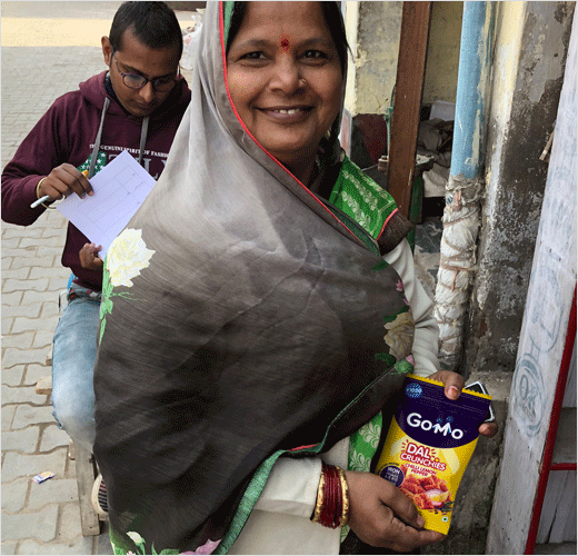
GoMo's first snack range – 'Dal Crunchies' – has reportedly been created to help close the nutritional gaps of six- to 18-year-olds throughout the country, with flavour profiles specifically attuned to the Indian palette.
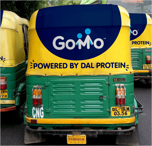
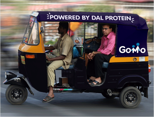
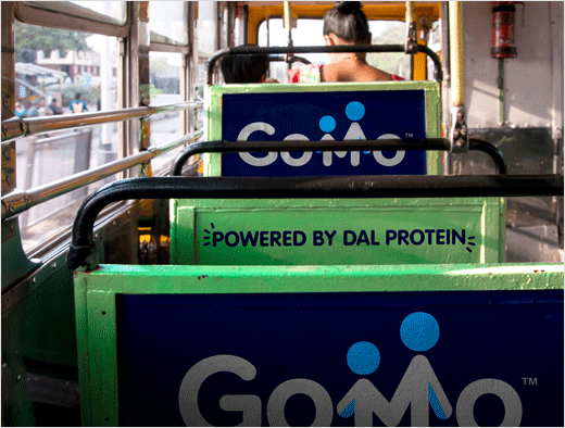
Straight Forward Design says it was enlisted to create a brand identity that would "appeal to and be trusted by Indian mothers", and which would be able to work across the country's 22 different languages.
"We wanted to create a positive, optimistic identity to send a very clear message to mums: 'This is a safe, nutritious product that will give your child the strength to perform at his or her best every day'," comments Mike Foster, creative director at Straight Forward Design.
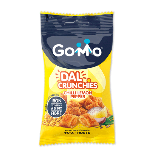
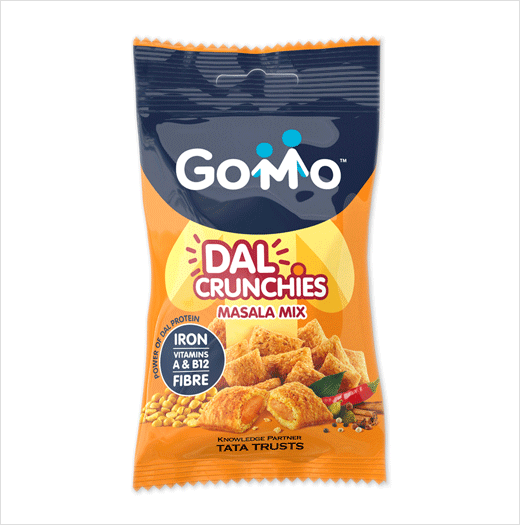
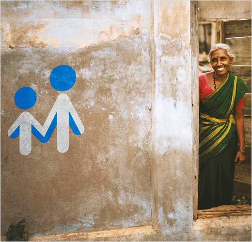
To appeal to mums, the "M" in GoMo's logo was developed to represent a mother and child holding hands, with the arrows forming the letter signifying "growth and vitality".
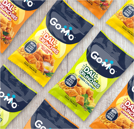
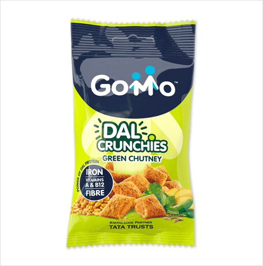
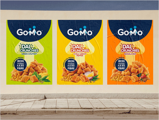
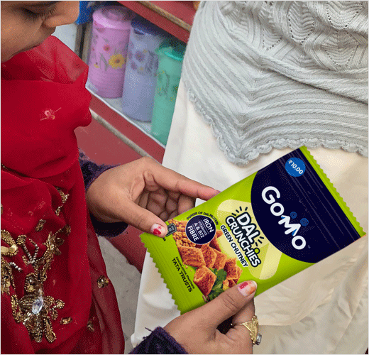
"A visual shorthand was developed to reach people across India regardless of language or literacy. To that end, images of the ingredients play a vital role on pack, with colours that represent delicious Indian flavours and their nutritional qualities. And a deep blue was chosen as the primary brand colourway across all variants – Chili Lemon Pepper, Masala Mix, Green Chutney – to provide consistency and to represent trust and efficacy," further explain the designers.

Straight Forward Design
www.straightforward.design


