Software Company ABBYY Unveils New Logo and Identity
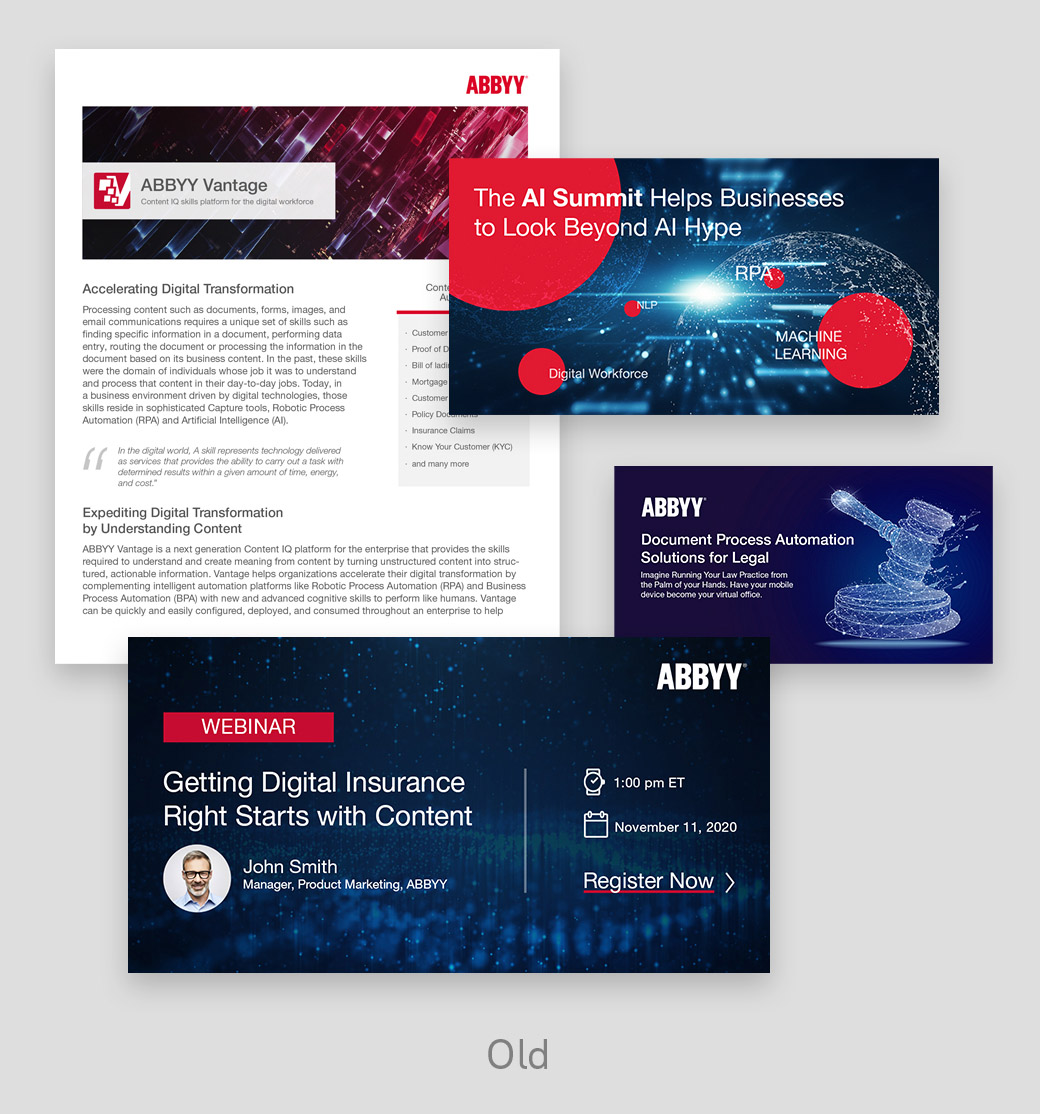
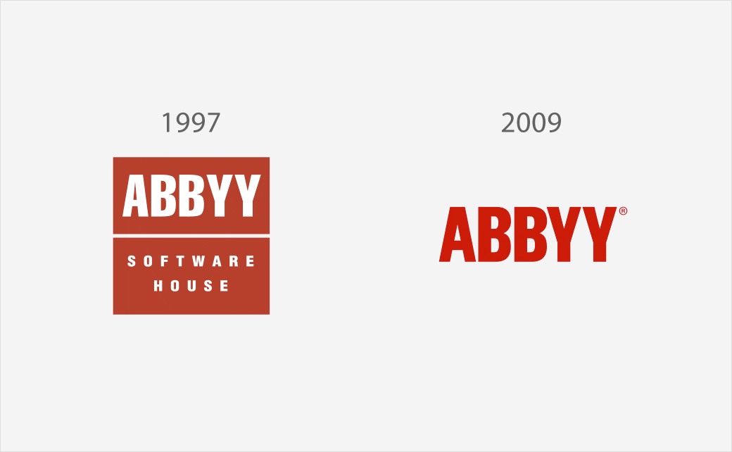
Software company ABBYY has revealed its new corporate brand identity, featuring a revised logo along with new illustrations and a modernised colour scheme.
The new brand design, which has been created in collaboration with Russian brand and design agency Shuka, has one main graphic, which features an unfolding shape that transitions from one design to another.
This is claimed to symbolise “transformation, a “turning point” and the “start of a new future”, while the new logo is claimed to be “timeless and modern” with a classic font set in a new, more vibrant red colour.
The accompanying colour palette is described as being “energetic and modern” with the gradients representing transformation.
“Customers and prospects will see connections to who ABBYY is in the designs – fresh and exciting, professional yet fun, and personal,” says the Moscow-headquartered company, which was originally founded in 1989 as “Bit Software” by Armenian-born Russian entrepreneur, David Yang.
“After announcing our new Digital Intelligence portfolio last year and identifying new market positioning and brand personality, we wanted to evolve our look-and-feel that brings this new vision to life and clearly communicates these key brand attributes,” further explains ABBYY’s marketing boss, Scott Opitz. “We were inspired by what our customers shared with us through a series of interviews and decided to take a fresh look at our corporate brand. We took their feedback and now the new ABBYY look translates to how we invite customers, partners, and employees to experience and engage with us, to transform and reimagine.”
ABBYY claims its technologies are used by over 5,000 companies, including many of the Fortune 500. It currently has offices in 14 countries.



Source: ABBYY


